Overview
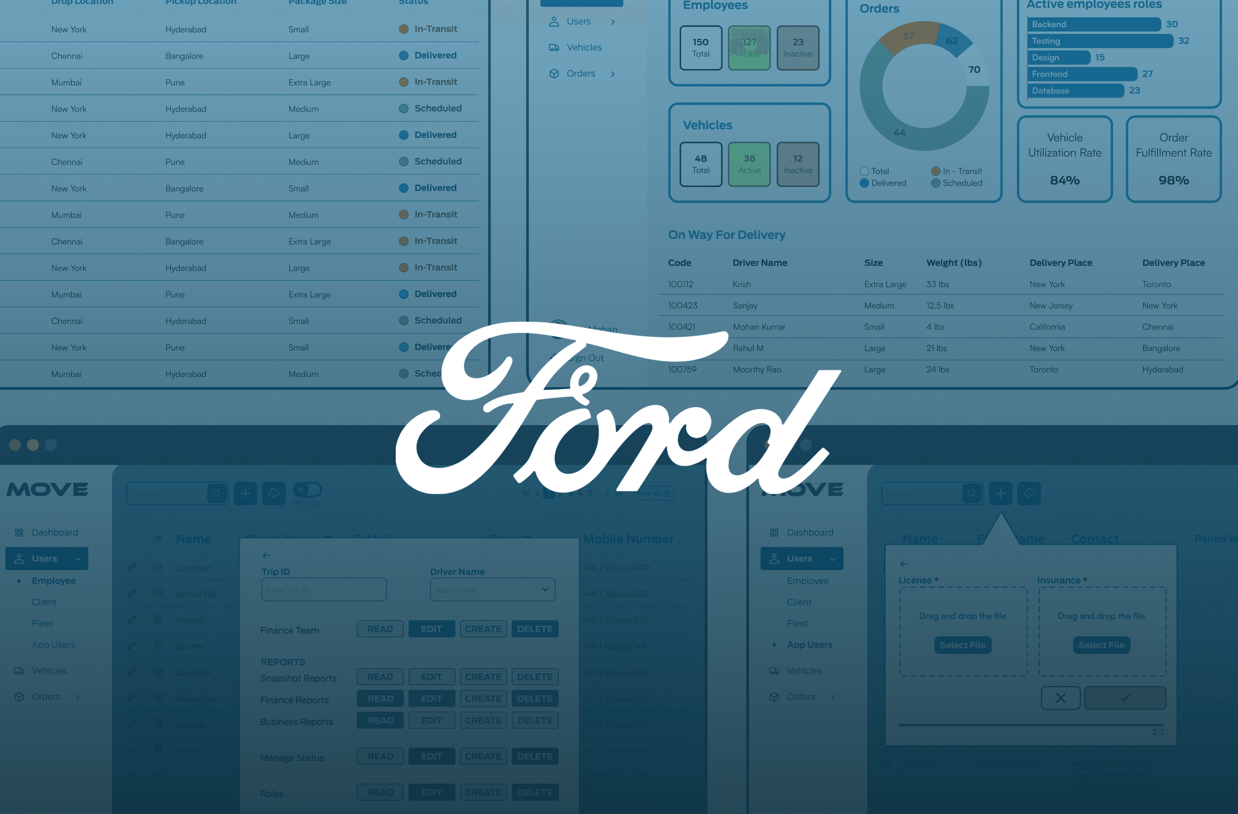
Ford Move is the internal platform Ford's teams use to manage inventory, track shipments, coordinate orders, and communicate with dealers. It had grown into the single most-used tool for several operational roles, but the interface hadn't kept pace: every user, regardless of role, landed on the same undifferentiated screen and worked through the same navigation to get to entirely different tasks.
I redesigned the platform around role rather than screen, working directly with the product manager and the engineering team over a three-month internship.
The problem
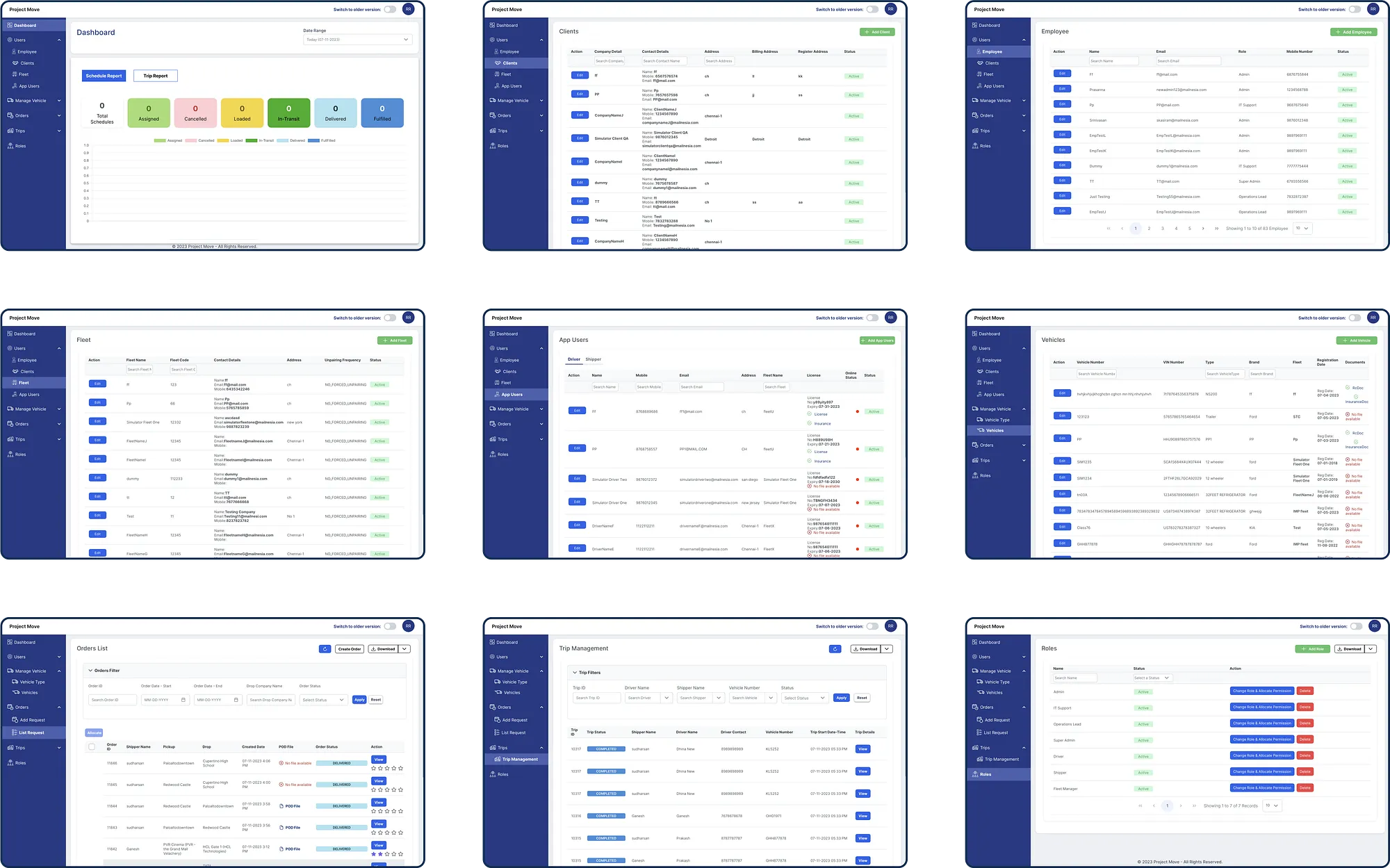
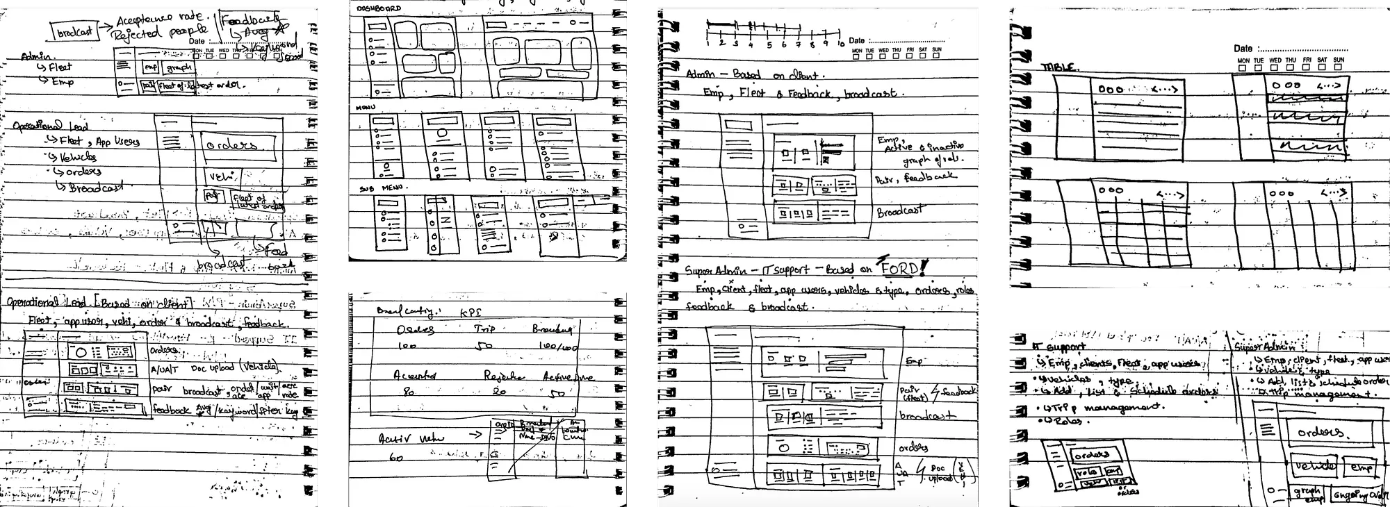
The portal had one dashboard for everyone. An admin managing inventory, a coordinator tracking a shipment, and a rep communicating with a dealer all opened the same screen and navigated the same six-item menu to reach unrelated tasks. Related information lived on separate pages, so routine work meant repeated round trips through navigation that wasn't built for any one job in particular.
The platform had also been built outside Ford's established design system — none of the developers I worked with were aware one existed. I found a detailed third-party writeup of Ford's design language and used it to reconstruct a consistent visual and interaction system for the redesign, checking it against the live product wherever I could to confirm it held up.
Research
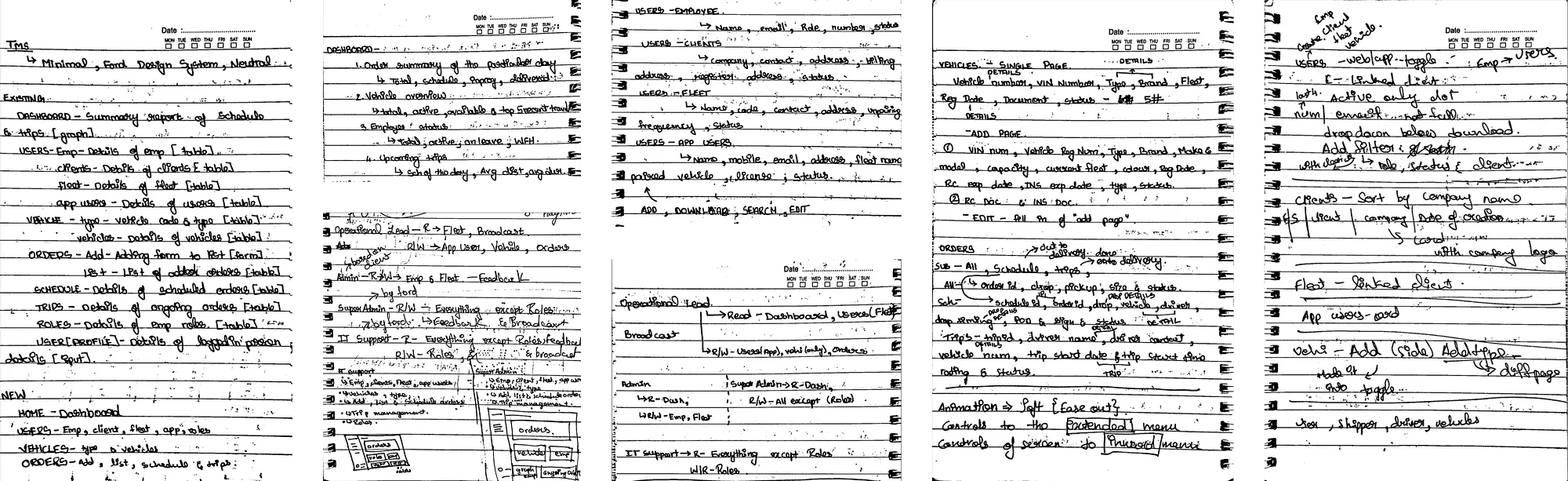
Ford Move's users are internal — admins, coordinators, and dealer-facing staff — and I didn't have direct access to them during the internship. I ran the research with the people closest to that gap: the product manager and senior developers and testers who worked with these users daily, through structured discussion sessions to surface pain points and requirements. I supplemented that with secondary research into admin dashboard patterns and internal tooling best practices, to test our assumptions against how other operational platforms had solved similar problems.
That's a proxy for direct user research, not a replacement for it, and it shaped one specific decision: rather than trying to guess at every workflow from secondhand descriptions, I designed around what could be confirmed with structured data — role, permissions, and job function — since those were the sources of task variance the team could describe precisely.
The redesign
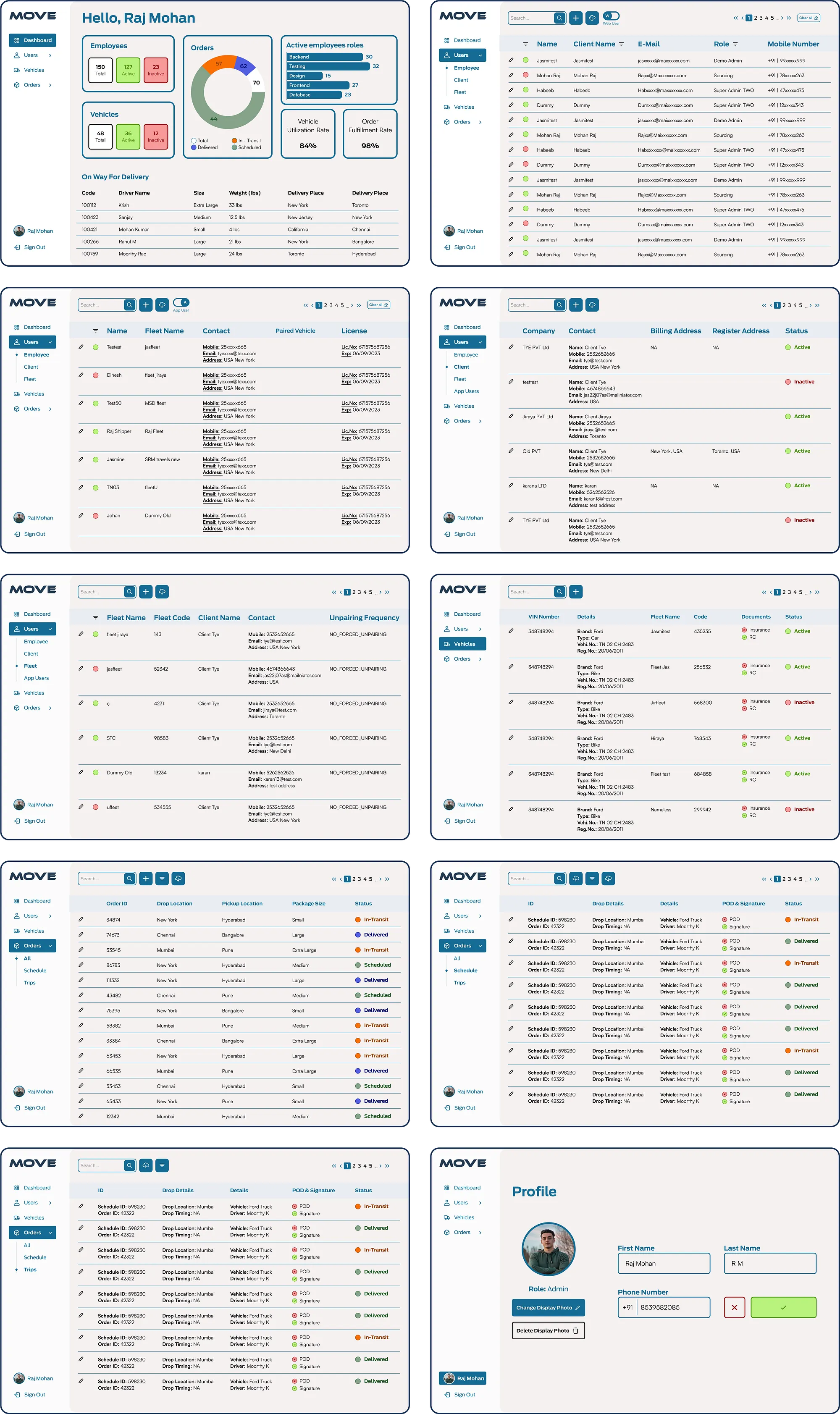
Role-based dashboards. The core decision. Instead of one screen serving every role, each user now sees a dashboard scoped to their permissions and job function, built off the same underlying data. An admin's default view surfaces inventory and daily operational data; a dealer-facing role surfaces communication and order status. Same platform, same data layer, different starting point depending on who's using it.
Navigation, cut from six to four. Menu items that didn't map to a clear task for most roles were folded into the pages they supported, rather than sitting as permanent top-level options.
Page consolidation. Related information that had lived across multiple pages was combined into single views, so a task that previously required navigating between pages could be completed from one screen.
Pointer travel. With frequently used controls repositioned against observed task paths, average mouse pointer travel dropped by at least 60% across the redesigned flows.
Dark mode, implemented within the constraints of Ford's design system rather than as a standalone addition.
Constraints
Three worth naming directly. I didn't have access to Ford Move's actual end users, so the research is proxy research through the PM and dev team, not direct observation — a limitation I designed around rather than around. The design system had to be reconstructed rather than referenced, from a third-party source rather than Ford's own documentation. And as a three-month internship, I didn't see the redesign through to a shipped, measured outcome — the numbers above are pre-launch, from the design and testing phase.
What I'd do differently
Push earlier for even indirect access to end users — a recorded session, a support ticket log, anything closer to primary data than a proxy description. And build the case for a documented, discoverable Ford design system as part of the deliverable, not just apply one quietly, since the next person on this codebase will hit the same problem I did.

SKSKS
Brand & Product Designer