Role - Founding Designer (contract) → Design & Marketing Lead (full-time)
Timeline - Oct 2024 – May 2026 · 19 months
Scope - Research · Product design · Brand identity · Go-to-market
Platform - Tablet, desktop, mobile-optimised · Role-based access
Team - 2 Frontend Developer, 2 Backend Developer, 1 Product Managers and 1 Designer and Researcher
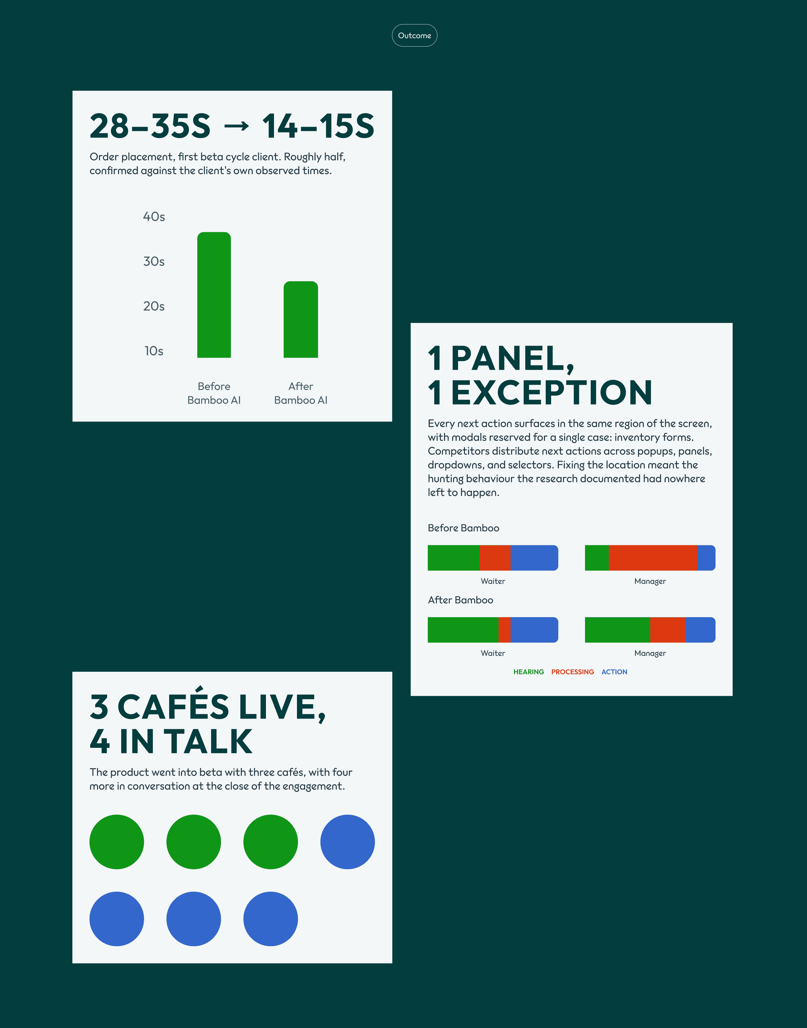
Outcome - Order placement 28–35s → 14–15s · Beta with 3 cafés, 4 more in conversation
Overview
Bamboo builds order management software for restaurants and cafés. I joined as the first designer, when the company was an idea and a logo, and stayed nineteen months, moving from contract to full-time. I owned everything the product needed in order to exist and to be sold: the research, the product design, the brand, and the material the founders used to raise and to close partner cafés.
The work began with a question nobody at the company could answer from a desk. Restaurant software is mostly built by people who have never worked a service, and it usually shows. So before designing anything, I went and worked one.
The product went into beta with three cafés, with four more in conversation. In the first beta deployment, placing an order dropped from 28–35 seconds to 14–15.

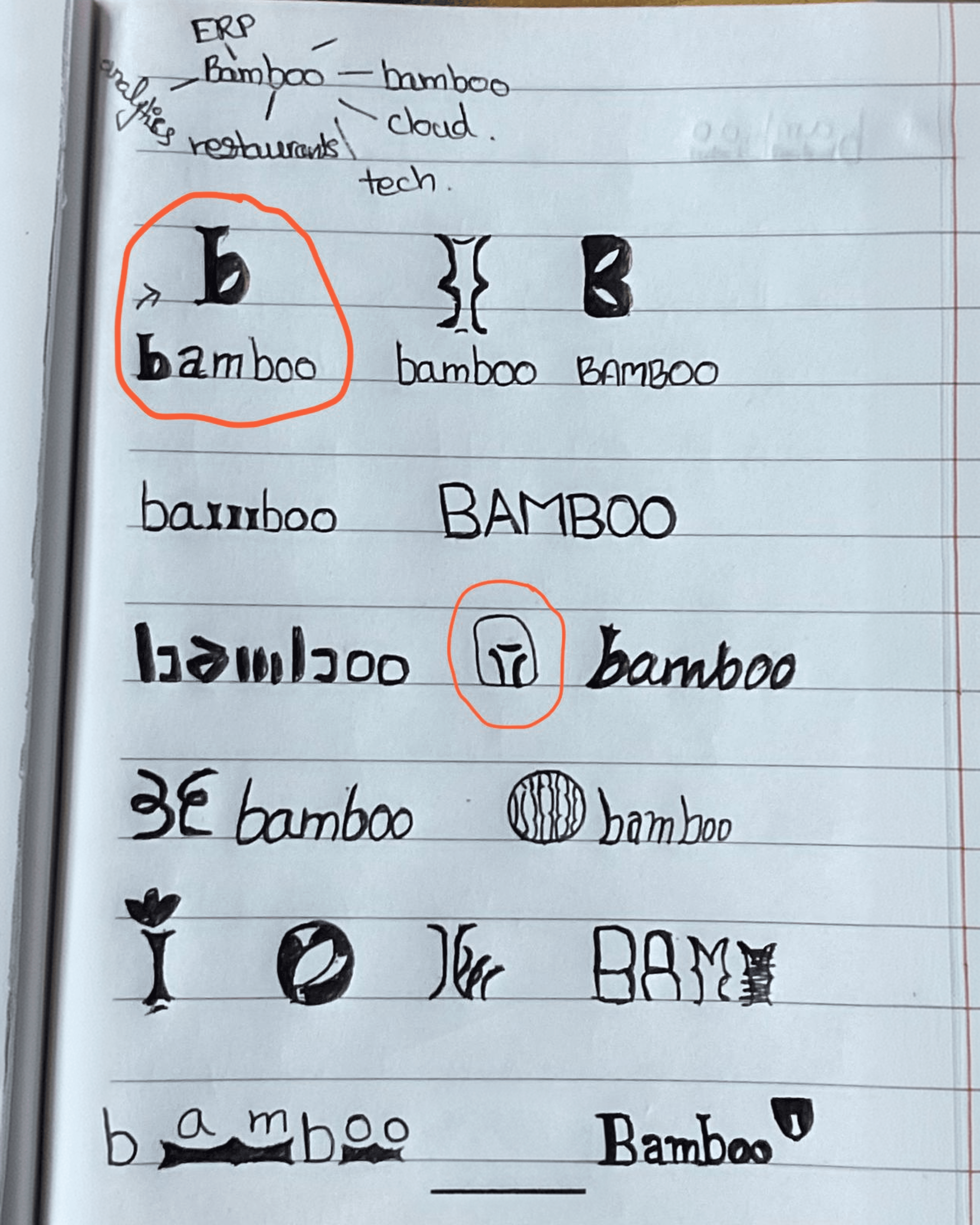
I joined Bamboo when it was an idea and a logo a freelancer had drawn. No product, no flows, nothing to redesign.
The founder was working out of Spain, where the state of the art in a large number of small restaurants was a waiter typing orders into the Notes app on their phone, or a thin custom-built app doing barely more than that. The competitors that did exist were built for the manager who buys the software, not the four people who use it.
Because an order is not one person's job. It starts at a table, passes through a kitchen, becomes money at a counter, and depletes stock in a back room. Four roles, four different pressures, four different ideas of what the software is for. Most systems in the category are designed for one of those roles and inherited by the other three.
With nothing to redesign, the first question wasn't what to build. It was what actually happens during a service, and where the existing tools break.
Research Approach
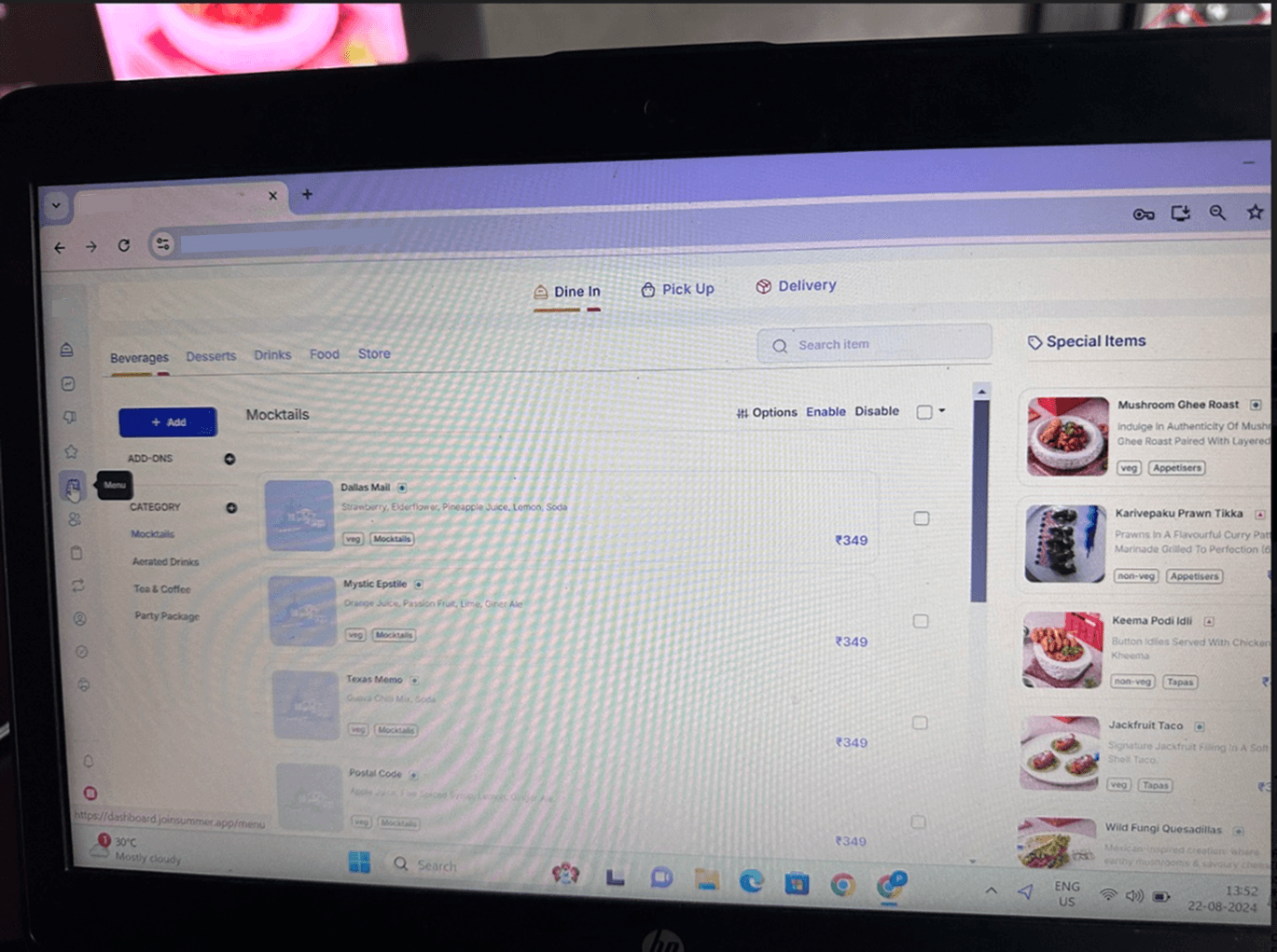
I spent 90+ hours in interviews, contextual inquiry, and on-site observation, recorded across every role that touches an order: owners and general managers, waiters and order takers, cashiers, and inventory management leads. Alongside that, I worked through competitor systems task by task to find where they broke down.
Covering the full chain was deliberate. A decision that makes a waiter's screen two taps faster can make the inventory lead's evening an hour longer. Research that talks to one role produces software that optimises one handoff and quietly breaks the rest.
When interviews stopped working
The first thing the research found was that the research method was wrong.
Waiters, order takers, and cashiers had no complaints about the software they used. Asked directly, they described it as fine. Interface quality registered to them as a luxury, something nice restaurants might have, rather than a condition of doing their job well.
People who don't believe a problem is fixable don't report it.
So we stopped asking and went to work. I spent hours taking orders on the floor myself, using the tools they used, and observing others doing the same job under real service pressure. Everything in the next section came from watching, not from asking.
Findings
Waiters were playing a guessing game with the interface. 🤔
Cancel and modify controls appeared in different places depending on where you were in the flow. There was no positional logic to learn, so every order involved a small hunt for a control that had moved. Watching it, and then doing it, the closest description was a game: tap, scan, guess where the button surfaced this time.
The cost wasn't the seconds. It was that the hunt happened while a customer stood waiting.
Managers were locked out of their own inventory. 📦
To onboard a new vendor or remove one, a manager had to contact the competitor's customer support and ask them to do it. A routine operational change, in a system the restaurant paid for, required a support ticket to a third party.
Adding items to inventory under a specific vendor was possible, but the path to it was unclear enough that managers guessed at it too.
Legibility failed, and muscle memory hid it. 👁️
Labels were poorly padded, margins were thin, and on a small screen text was genuinely hard to read. Waiters had absorbed this. They used the system constantly, so they'd learned the shapes and stopped reading the words, and the problem became invisible in their behaviour.
Managers hadn't. They used the system occasionally rather than constantly, so they had no muscle memory to fall back on, and they paused for five to eight seconds between steps, reading.
This was the most useful thing the research surfaced, because it explained why the problem had never been reported. The frequent users had compensated for it, and the occasional users assumed the delay was their own fault. Neither group described it as a defect. It was only visible by timing people.
Product Design
Platform and roles
Tablet first, with desktop and a mobile-optimised layout. Roles are assignable, and each role sees only the options and flows belonging to it, so a waiter's interface isn't carrying a manager's inventory controls and vice versa.
The operating constraint
Staff work at speed, standing, on shared devices, and are interrupted constantly. A mis-tap doesn't cost a click. It costs a live order and a conversation with a customer who is watching.
The user base sharpened that further.
Waiters and order takers were mostly 19 to 27, and literacy and formal education varied widely across the group.
Any design that required reading in order to act was going to be slow for some of them and unreliable for others.
Decisions
Actions stopped being words.
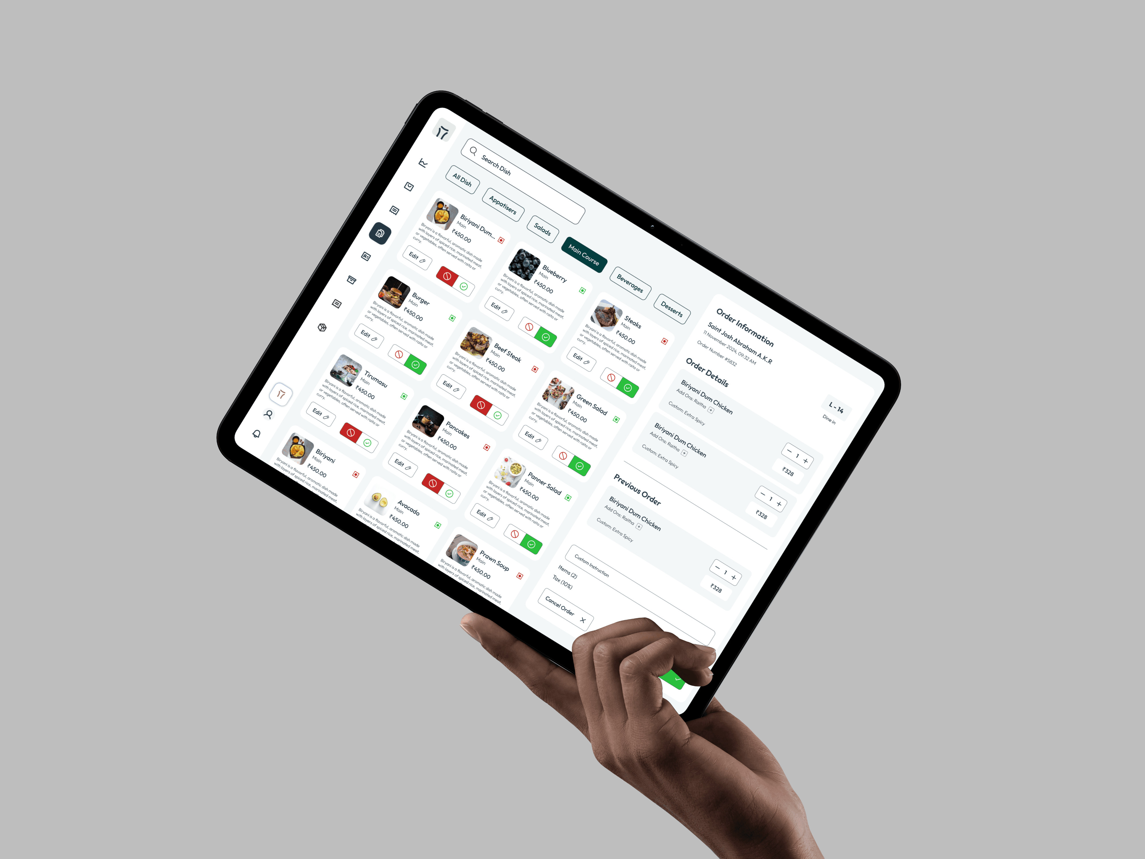
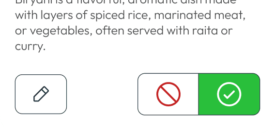
For every action a waiter takes during service, the label came out and a consistent colour-and-mark system went in: green with a check to confirm, red with a cross to cancel, outlined with a pencil to modify, and so on down the set.
Why. Reading is the slowest part of acting when the user's literacy varies and the environment is a live service. A mark and a colour are recognised, not parsed.
What stayed. Text labels remain in menus and navigation, where a user is orienting rather than executing and where the vocabulary has to be precise. The system is applied to actions, not to everything, and that boundary is the point.
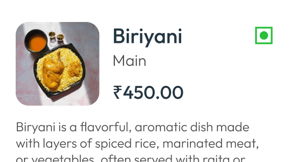
Menu items became images.
Competitors presented menus either as a table or as text-heavy cards, with item names truncated to fit. In observation, staff recognised a dish from a picture faster than from a clipped string of text, so every menu card carries an image.
Why. The recognition is visual and near-instant. Truncated text forces a read, and often an incomplete one, on the item a waiter selects hundreds of times a shift.
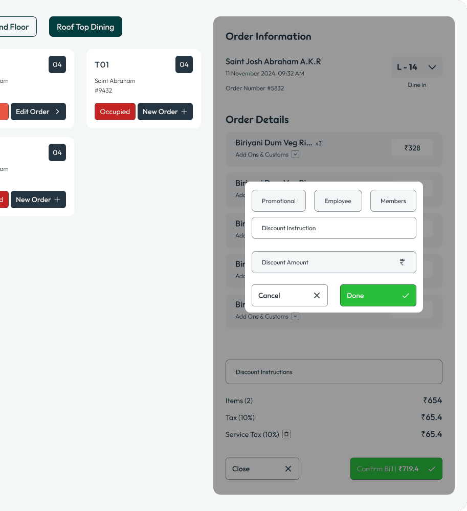
One panel, always in the same place.
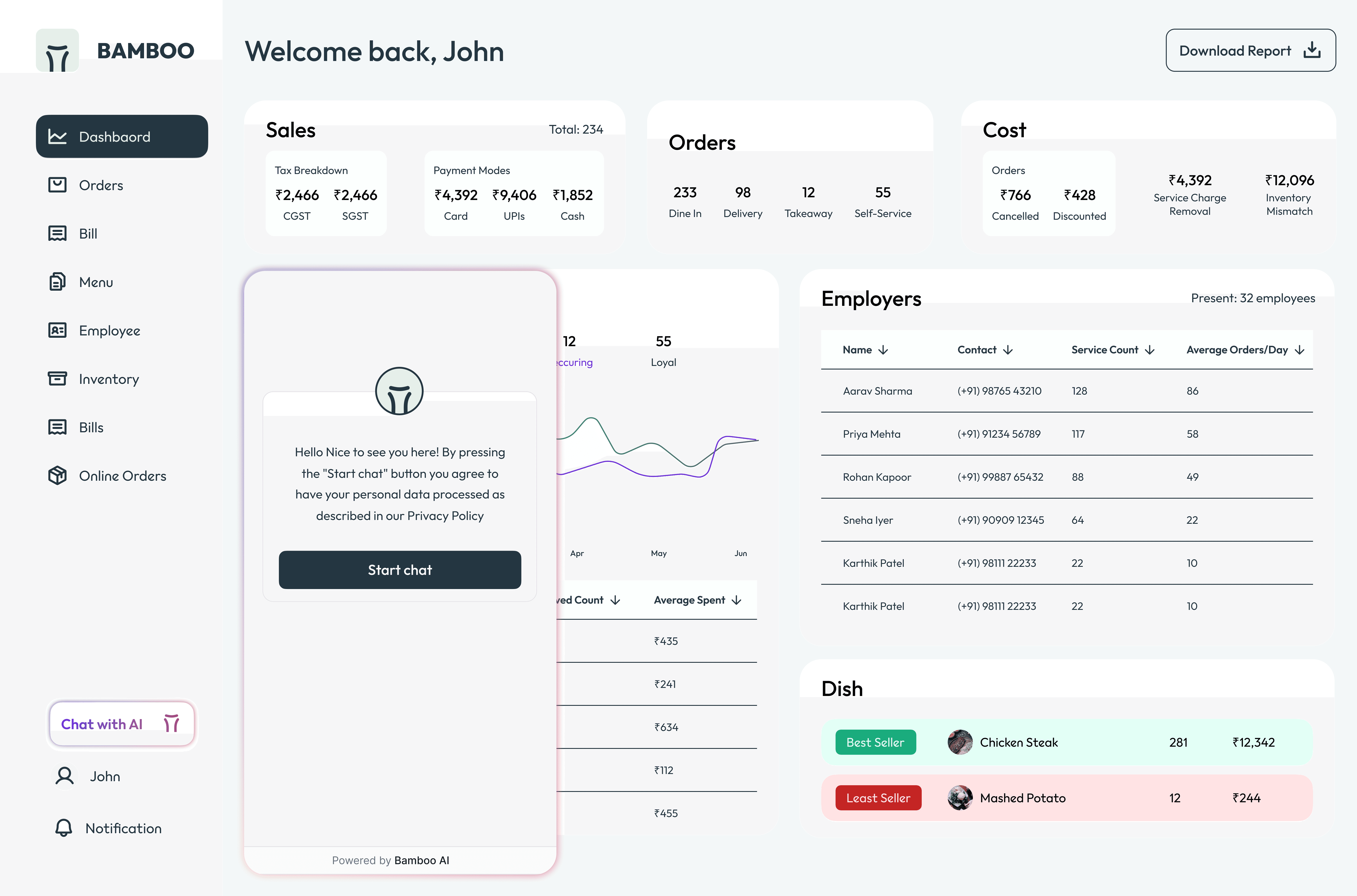
Tapping a card opens its detail in a right-hand panel. Adding an order happens in the right-hand panel. Every next step in the ordering flow surfaces in the same region of the screen.
Why. This is the direct answer to the guessing game. Competitors distribute their next actions across popups, right panels, dropdowns, and selectors, so a user has to work out not just what to do but where it will appear. Fixing the location means that after the first order, a waiter knows where to look before the screen has finished rendering. Predictability is doing the work that memorisation was doing before.
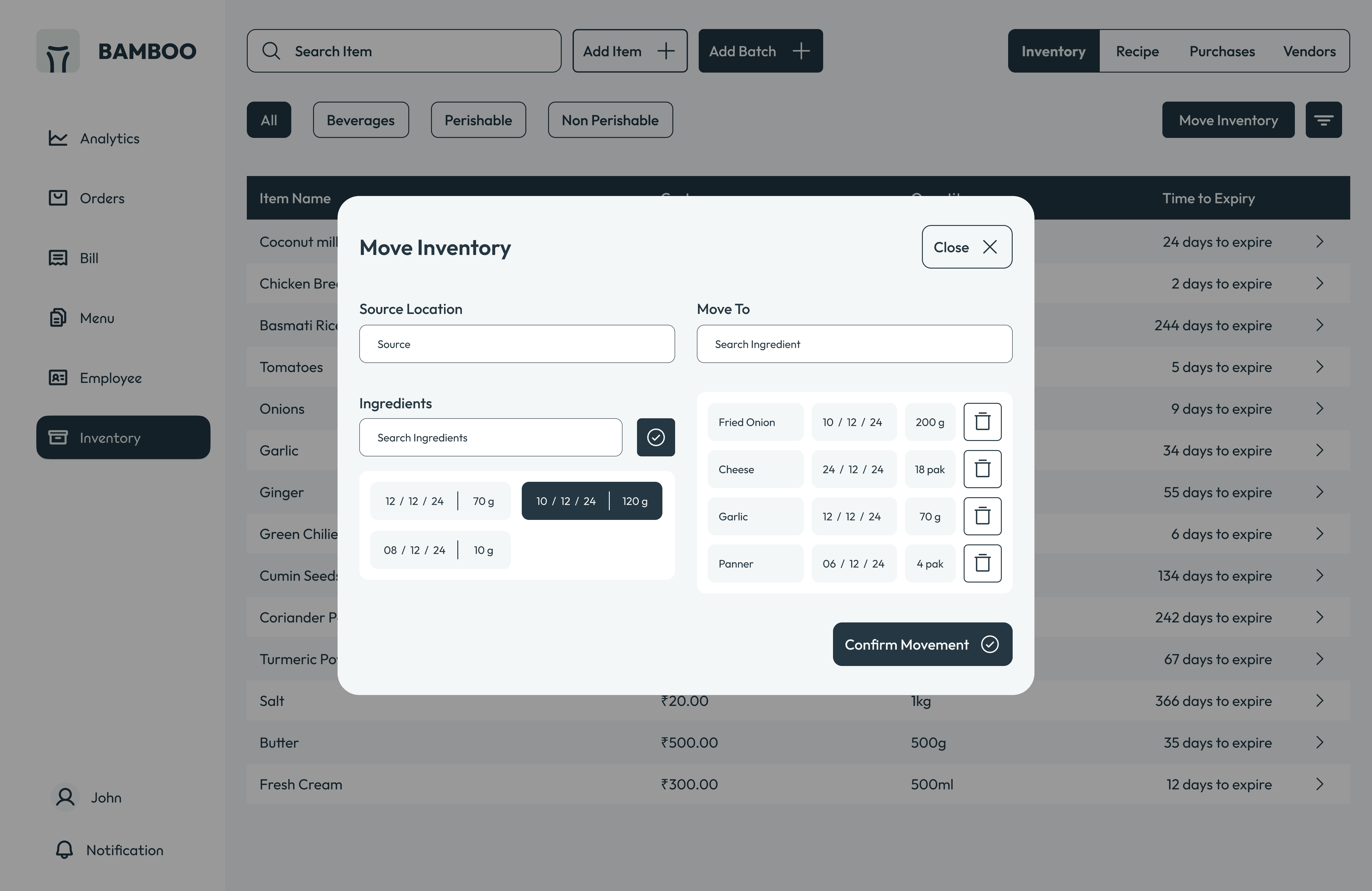
The one exception. Modals are reserved for a single case, filling in inventory forms. Keeping the exception to exactly one is what makes the rule legible.
The Manager's View
Everything so far was designed for someone moving fast: a waiter mid-service who needs to act without reading. The manager and owner side of the product had the opposite problem.
Managers aren't executing. They're deciding. They open the product a few times a week rather than a few hundred times a shift, they're sitting down when they do it, and what they need isn't speed. It's comprehension, and enough confidence in what they're looking at to act on it.
Same product, same data, opposite constraint. Waiters needed the interface to require no reading. Managers needed it to reward reading.
Two audiences. One needs to act without thinking. The other needs to think without acting.
Analytics
The manager and owner surface covers what sold and what didn't, what stock is doing, and what the month looked like, delivered both as a live analytics page and as a monthly report.
The questions it was built to answer came out of the same research that shaped the floor:
What are my best and least selling items?
What should I be putting together this month?
What do I need to order, and from whom?
Inventory carries its own data views on top of that, which mattered because inventory was where managers had been most poorly served. The system they were replacing required a support ticket to a third party to add a vendor, so the bar for "better" was low, and the opportunity to be genuinely useful was large.

AI
Bamboo's AI runs live in the beta, generating suggestions and insights across the product: what to combine on the menu, what to reorder, and patterns in food, customers, and staff performance. All of it manager and owner facing. None of it reaches the floor.
The design problem wasn't the model. It was that the model spoke in raw numbers.
An insight delivered as a bare figure asks the manager to do two jobs at once: work out what the number means, and work out whether to trust it. Those are different questions, and a page full of unlabelled outputs makes both harder.
The fix was to stop treating AI output as a separate kind of content. Every insight the system generates is rendered in the same chart vocabulary as the analytics it sits beside. A suggested combination appears the way sales data appears. An inventory recommendation appears the way stock movement appears.
Two things follow from that. The manager reads AI output using a visual grammar they already know, so there's no second interface to learn. And because the insight is drawn in the same form as the underlying data, it can be read against that data rather than taken on faith.
Outcome
Against the system in use at the first beta client, placing an order fell from 28–35 seconds to 14–15 seconds, roughly half, confirmed against the client's own observed times.
28–35s → 14–15s Order placement, first beta cycle client.
The second effect was harder to time but easier to explain. Because every next action surfaces in the same panel, the interface stopped requiring users to predict it. The hunting behaviour the research had documented had nowhere left to happen.
The product went into beta with three cafés, with four more in conversation.
BRAND IDENTITY



SKSKS
Brand & Product Designer