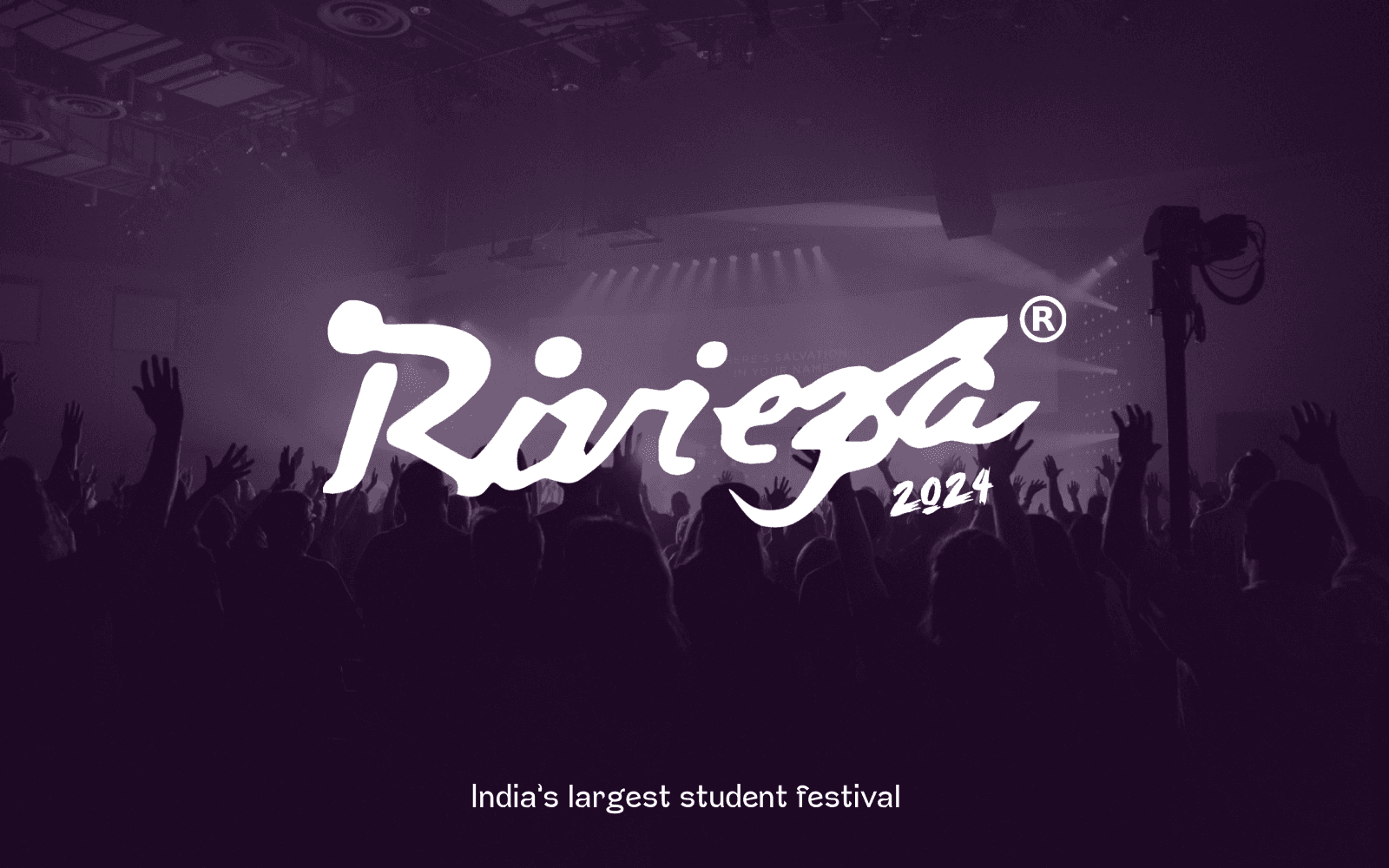
Behind The Scenes: My Journey as the Design Organizer for Riviera’24!
Introduction
From the first brainstorming session to the final curtain call, organizing the design elements for VIT Vellore’s Riviera’24 was a whirlwind of creativity, collaboration, and countless coffee cups ☕. Let me take you on a journey through my experience as the design organizer, where every visual detail contributed to making this event a memorable one.
Riviera is no ordinary event; it’s India’s largest student festival! With a staggering cash prize pool of over 10 lakh rupeesfor competitions, it attracts participants from far and wide. This year, we had more than 50,000 attendees from over 15 countries, making it a truly international celebration. The festival featured over 150 events and saw participation from students of more than 100 institutes. It was an explosion of talent, creativity, and cultural exchange! 🌏🎉
Initial Involvement and Role
When I was first interviewed to be the design organizer for Riviera’24, I had no idea what I was getting myself into. As someone passionate about design and creativity, I eagerly accepted the challenge, not realizing the extent of coordination and creativity it would demand. Little did I know, I’d be swimming in a sea of colors, fonts and catastrophe! 🎨😂
Building on Past Successes
Before diving into this year’s festival, it’s important to acknowledge the incredible design team that laid the groundwork in previous years. Their dedication and creativity set a high standard and provided a strong foundation for our current efforts.
The Legacy Team
The design team was led by myself and other two, our team were known for our innovative approach and cohesive visual storytelling. Their work on previous event, was nothing short of spectacular. From the vintage-inspired posters to the time capsule installations, their designs left a lasting impression on everyone who attended.
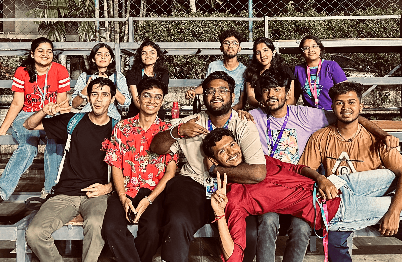
They were the much helpful of incorporating interactive elements in digital platform and around the campus, a tradition we proudly continued this year. Our journey to made a lot of teachings even more memories.
Planning and Preparation
The initial stages involved numerous brainstorming sessions with the core team. Our goal was to create a visual identity that resonated with this year’s theme, ‘Modern-Retro’. Collaborating with the marketing team, we ensured that our designs were not only visually appealing but also aligned with the festival’s message. Spoiler alert: There were lots of dumped design involved! 📝
We used a variety of design tools like Adobe Illustrator, Photoshop, Figma and Procreate to bring our ideas to life. The process was iterative, with each draft undergoing rigorous review and feedback from different organising officials. The number of “back to the drawing board” moments was astronomical! 🚀
Graphic Design
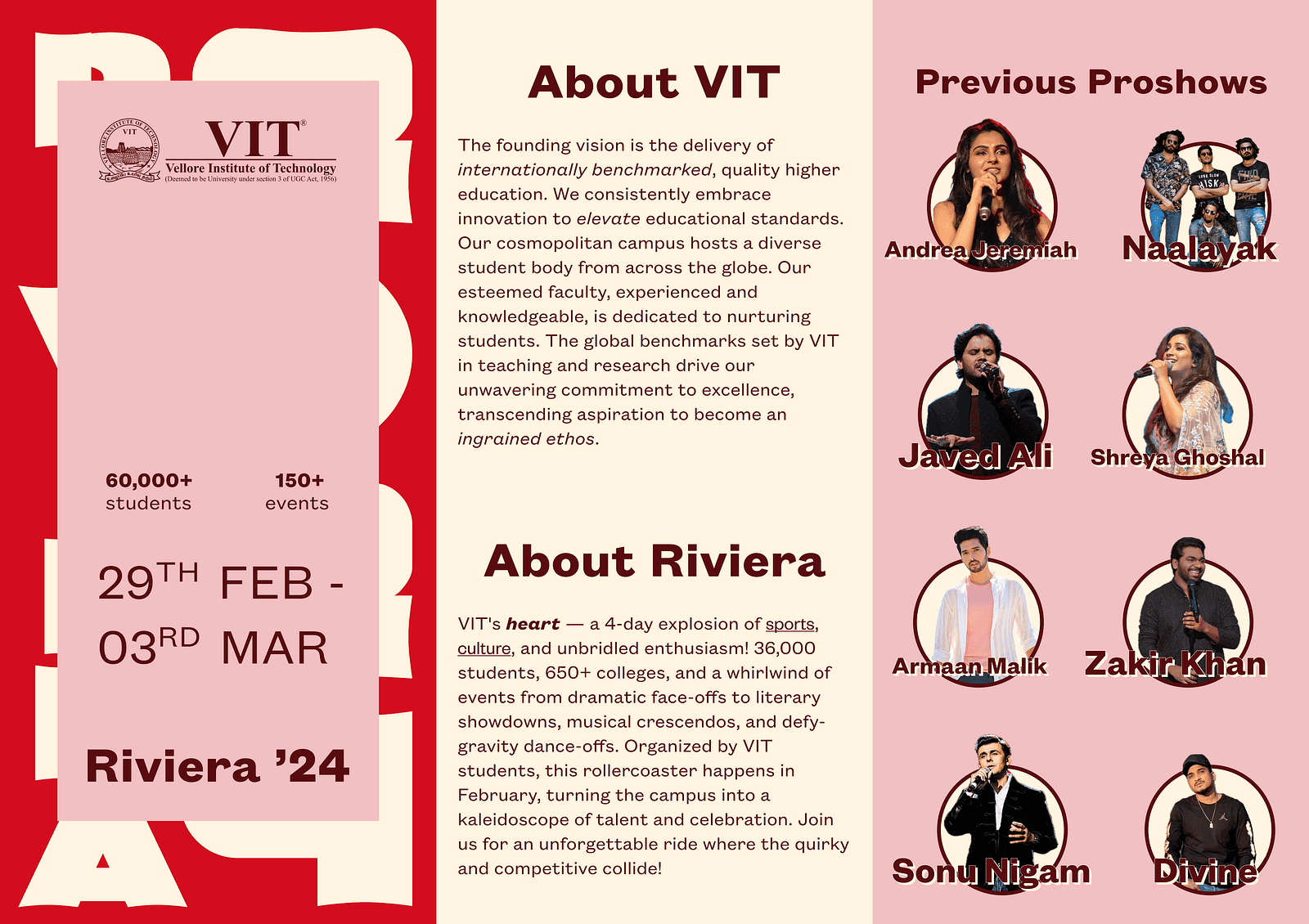
We designed a series of vibrant flyers and posters that captured the essence of our theme. Each design element was carefully crafted to attract attention and convey important information about the festival events.
Fun fact: We went through 27 shades of purple before finding the perfect one! 💙
Social Media Design
To ensure a cohesive online presence, we created a set of graphics for social media. These designs included countdown posts, event announcements, and interactive stories to engage the university community. I think we broke the internet with our countdown posters! 😆📱
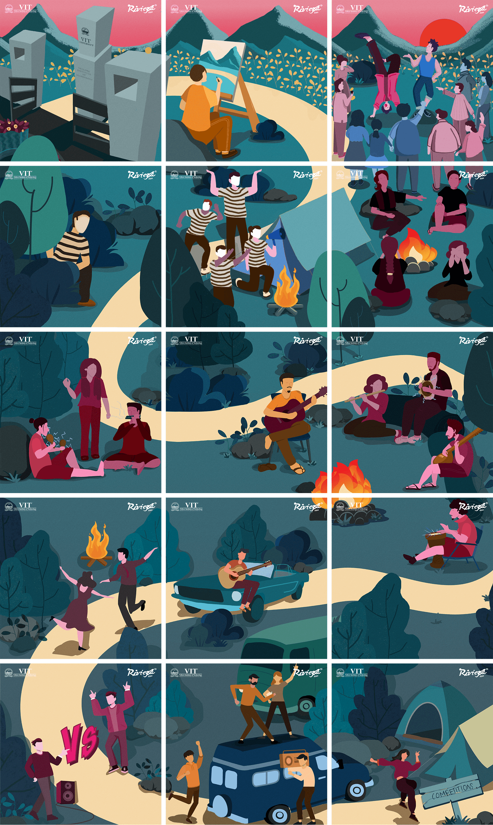
The graphic design showcased below highlights some of the top competitions at Pre-Riviera. We crafted a 5x3 grid poster, where each segment represents a specific event, collectively illustrating a journey to our university. 🎨✨🛤️
Videos for Social Media
We produced several short cinematic videos and trending reels to promote the festival on social media. These included teaser trailers, behind-the-scenes footage, and highlights of previous festivals to build excitement and anticipation. Our blooper reel was longer than the actual promo! 🎬😂
Mascot Design
The mascot design was one of the most stressful parts of our preparation. After having multiple ideas rejected by the officials, we received an surprise call one night requesting a mascot design as soon as possible to be ready in time for Riviera.
The mascot had to be playful and modern with a concert vibe, yet also ferocious, sporty, and challenging.
This is what our faculties said! We brainstormed various ideas, including animals, animated characters, and even a human figure, but each faced obstacles. Ultimately, we decided on a grizzly bear wearing cargo pants and a hoodie (yes, they were part of this year’s merchandise) and having a guitar and a basketball. We chose the grizzly bear because it embodies strength and resilience — qualities highly valued in sports — and adaptability, symbolizing versatility, making it perfect for both sports and night concerts. Despite their powerful presence, bears can be friendly and approachable, especially when dressed in a hoodie and cargo pants, making our mascot relatable and appealing to festival-goers of all ages. The casual attire adds a cool, laid-back vibe that aligns with the festival’s spirit while also symbolizing community and togetherness. Plus, a grizzly bear mascot in a hoodie and cargo pants is unique and memorable, adding fun and excitement to the festival. Of course, we went through various iterations before finalizing the design. 🐻🎨✨🛤️

Event Execution
As the festival approached, our focus shifted to implementation. It was exhilarating to see our designs come to life across campus. Of course, there were last-minute challenges, like a banner printing error, but quick thinking and teamwork helped us navigate these hiccups seamlessly.
Pro tip: Always double-check the spelling and zeros on banners! 😅
Merchandise
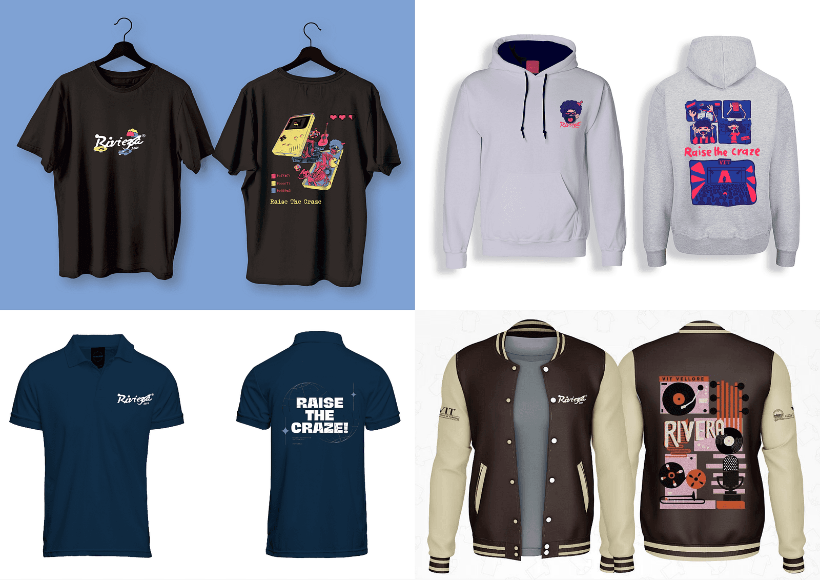
We designed a range of merchandise including round neck t-shirts, polo t-shirts, hoodies and stickers. These items were not only popular among students but also helped promote the festival around campus and beyond. The t-shirts were so comfy, people wore them to sleep! 😴👕
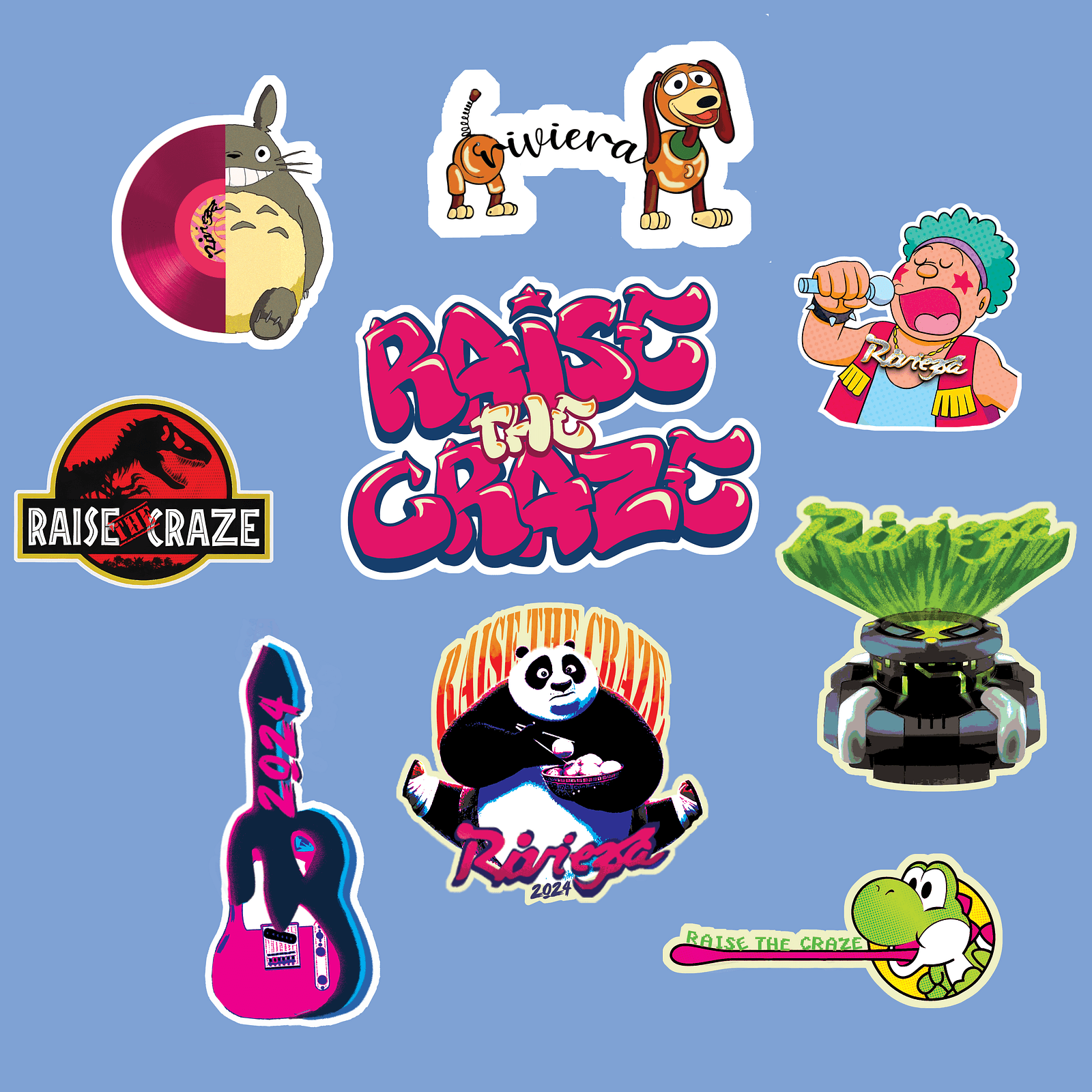
The stickers were perfect for personalizing laptops, water bottles, ID cards and notebooks. Their vibrant colors and high-quality material made them durable and eye-catching, making them a must-have keepsake from the festival. Not only did they help in promoting the festival, but they also added a fun, personal touch to the overall experience.
Students loved swapping and collecting different designs, turning these small items into cherished memorabilia.
Campus Decoration
While the campus decoration team worked separately, our design team was tasked with creating something timeless.
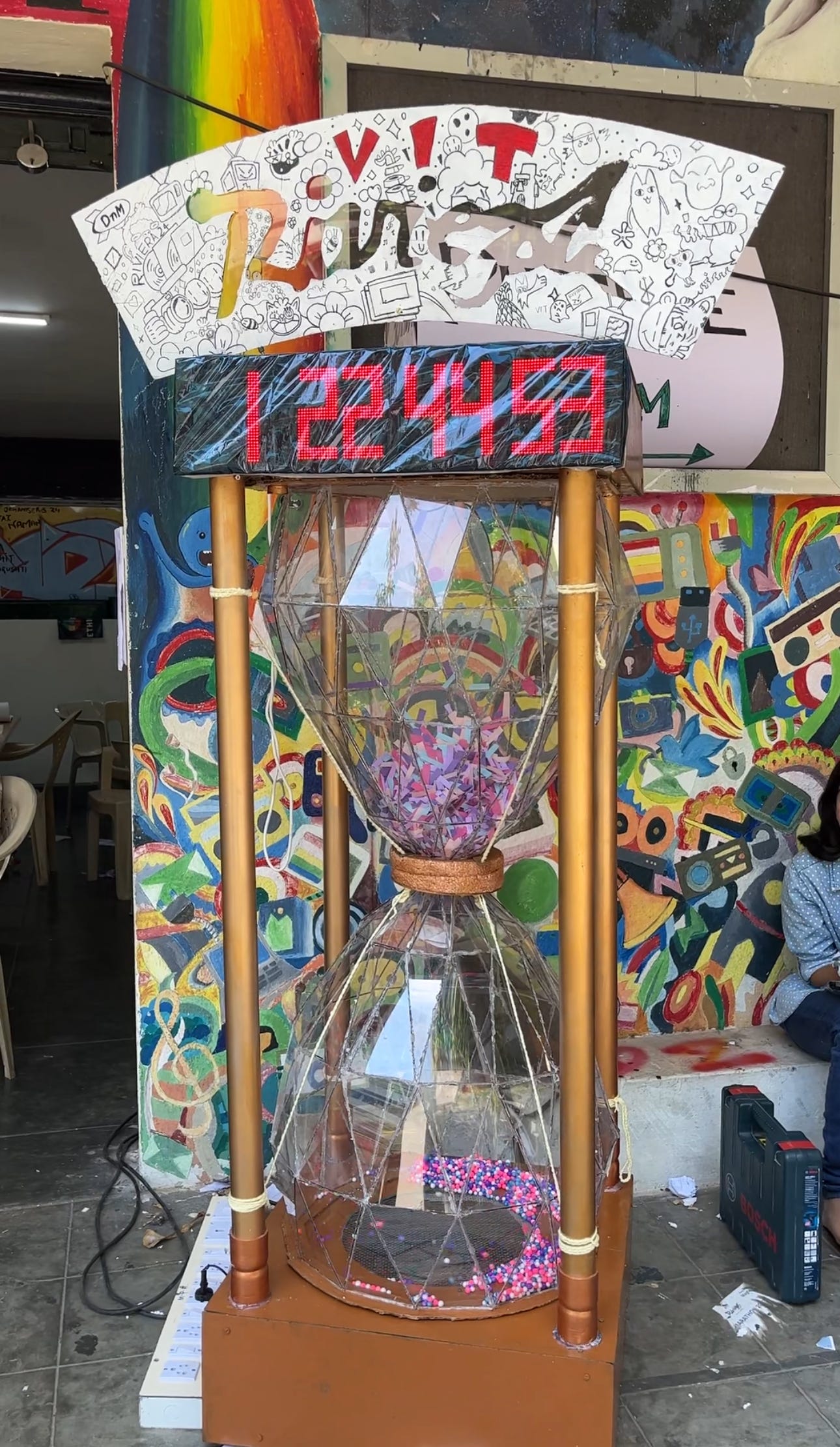
We decided to build a massive 5-foot hourglass with a digital timer on top with doodled sign board.
This hourglass became a stunning centrepiece that symbolised the fleeting yet impactful moments of the festival.
Hourglass Design
Creating the hourglass was both a creative and technical challenge. We used thermocol balls and paper strips to fill the hourglass, giving it a dynamic and eye-catching appearance. Precise angle measurements were crucial to ensure the hourglass looked perfect from all sides. We faced several issues with the laser cutting machine; it frequently malfunctioned, leading to misaligned cuts and wasted materials. We had to recalibrate it multiple times to get the precise cuts needed for the hourglass frame, which significantly slowed down our progress. Another general problem was ensuring the hourglass fit securely inside its stand. We had to make the stand both lightweight and sturdy, which required careful material selection and engineering.
Fun fact: We almost considered using duct tape and gluefor a quick fix! 😅🛠️
Countdown Timer
The digital countdown timer on top of the hourglass was particularly tricky. Each digit on the display was a combination of four LED segments, leading to power constraints. Additionally, the fan designed to make the balls and strips fly didn’t have enough power initially. These technical hurdles were daunting, but through perseverance and teamwork, we managed to get everything working perfectly.
Pro tip: Always double-check your power sources! 🔋💡
Doodle Design
Adding a playful touch to the hourglass, we decided to incorporate a doodle on top. The doodle needed to be engaging and whimsical without being offensive to anyone. This was a challenging task, as we had to ensure the design was inclusive and universally appealing. We also had to make sure the doodle could stand on its own atop the hourglass, which required additional structural support. After several iterations and feedback sessions, we successfully created a doodle that enhanced the hourglass’s charm and aligned with the festival’s spirit.
Fun fact: We went through over 70 doodle designs before finding the perfect set! 🖍️🐻
Special Guests and Performers
This year’s festival was graced by an amazing lineup of influencers, actors, musicians, and actresses who made the event truly unforgettable.
We had the pleasure of hosting an array of popular influencers, renowned actors and actresses, and incredible musicians who added star power to the festival and elevated the entire experience. Social media sensations brought even more attention to the festival with their posts and live stories, and their meet-and-greet sessions were a massive hit with attendees! 📸✨ The star-studded guest list also included renowned actors and actresses, adding a touch of glamour to the event. They even participated in some of our interactive sessions — seeing Samantha Ruth Prabhu having one to one QnA was a highlight! 🎬⭐ The festival’s musical performances were headlined by incredible artists like GV Prakash, Pineapple Express, and Agam, DJ Paroma and VDJ Zen whose electrifying performances on the main stage had everyone dancing and singing along. The closing concert by VDJ Zen was nothing short of legendary! 🎤🎸
Reflection and Impact
The feedback from attendees was overwhelmingly positive, with many appreciating the cohesive and vibrant visual elements. Personally, this experience was a tremendous growth opportunity, enhancing my project management and design skills. Seeing the festival’s success reaffirmed the power of effective design. Plus, I now have a newfound respect for coffee! ☕❤️
Conclusion
Organizing the design for Riviera’24 was a rewarding journey that combined creativity, collaboration, and a bit of chaos. I’m grateful for the opportunity to contribute to such a memorable event and for the incredible team that made it all possible. Here’s to many more festivals and even more creative challenges ahead! 🎉🎨
SKSKS
Brand & Product Designer