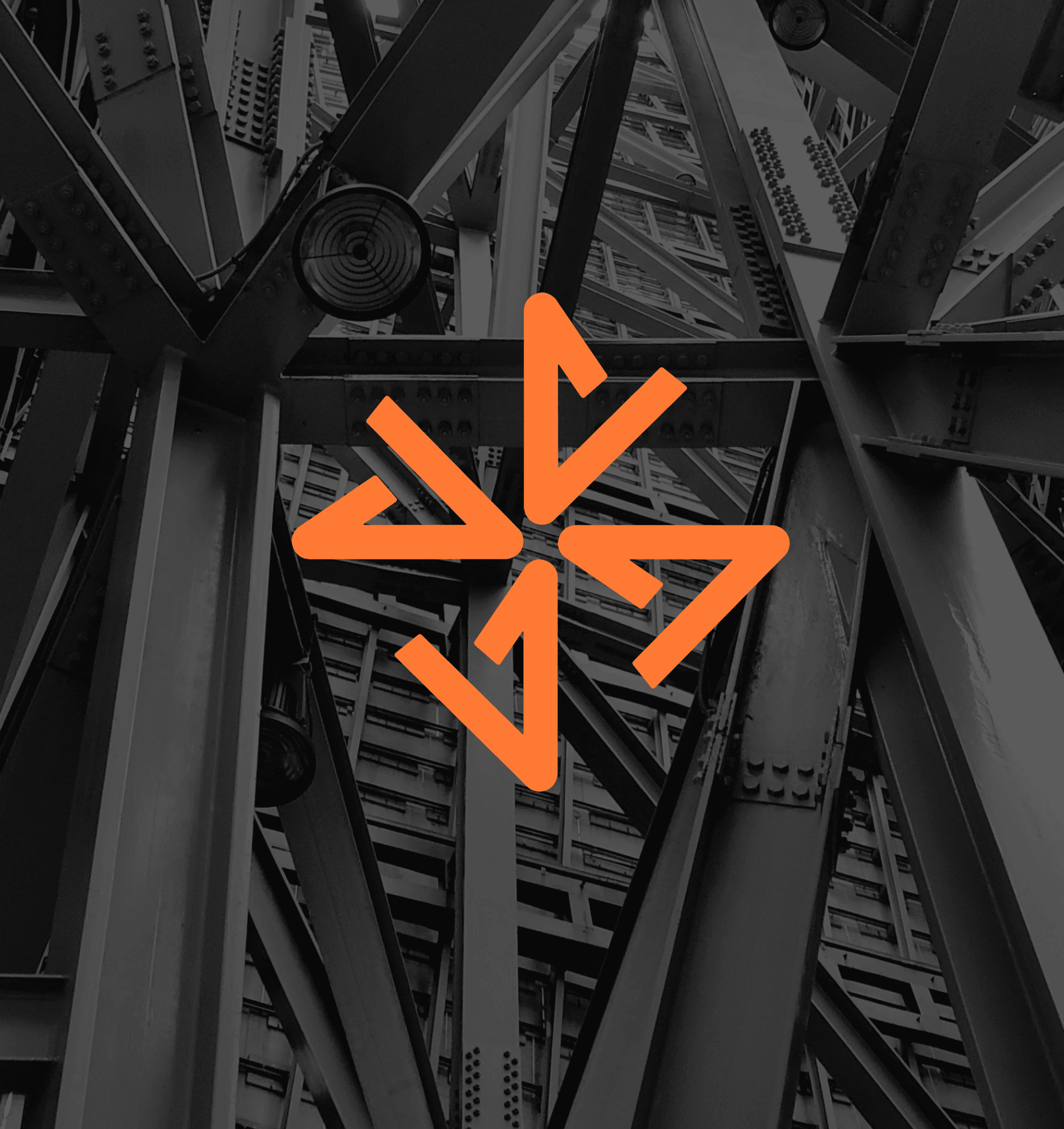
Overview
SupplyX is a B2B construction marketplace transforming into a tech ecosystem, connecting procurement, delivery, and finance in one place. Behind it sits three generations and more than 60 years in the construction supply industry, a business built entirely on offline relationships, now moving into e-commerce as an aggregator connecting buyers and suppliers directly.
The Problem
Sixty years of trust doesn't transfer to a browser on its own. SupplyX's reputation lived in relationships, in the middlemen the new model was specifically designed to cut out, and moving online meant asking buyers who'd worked on a handshake for three generations to work through a screen instead. The identity had to carry the weight of that history while looking credible in a market where the competition is digital-native and the buyer's first impression is a homepage, not a conversation.

The old logo had four problems, and they compounded.
- It broke at small sizes. The X lacked true symmetry, and its intersection was thin enough that the mark turned fragile the moment it scaled down, exactly the condition an e-commerce brand lives in: favicons, app icons, marketplace listings, supplier profiles.
- The grey was working against it. It cut legibility and drained visual strength, leaving a brand that read as dull or inactive, the opposite of what a 60-year-old business entering a new market needs to project.
- The X didn't read as a letter. It landed as an abstract geometric mark, so the connection back to the name never closed.
- And it told no story. The X had an obvious meaning available to it, connection, the cross-linking of buyers and suppliers, which is precisely SupplyX's entire business model. The mark never said it.
That last one mattered most. A logo that fails at small sizes is a technical problem with a technical fix. A logo sitting on top of the perfect metaphor for the business and not using it is a missed opportunity, and this rebrand's job was to take it.
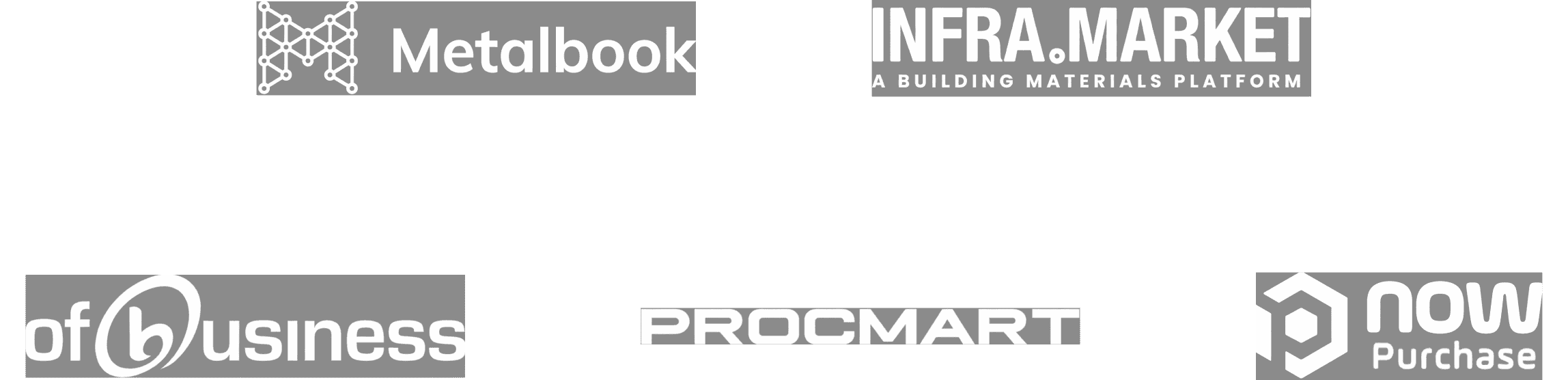
The B2B industrial marketplace category has settled into a narrow visual band, and every player in it is making broadly the same choice.
- Metalbook is generic and descriptive in name, industrial and old-style in execution, static and heavy in metallic greys, communicating functionally in a way that still reads as old-school operational.
- Infra.Market, the largest of the set, plays it corporate and serious: a static wordmark in orange and grey, corporate sans-serif, transactional and scale-based, built to project authority.
- NowPurchase leans the other direction into typical SaaS blue, 3D and softer-cornered, speed-focused and functional, so digital in feel that it stops reading as industrial at all.
- OfBusiness is corporate, formal, and distant, a simple wordmark with low recall, blue and green for trust and growth, rational fintech language for enterprises and SMEs.
- ProcMart is utility-focused and practical to the point of dated, extended type in orange and teal, selling strength, stability, and simplified procurement to industrial SMEs.
Line them up and the pattern is hard to miss. Every brand in the category is either too industrial to feel modern or too digital to feel credible in a trade built on relationships. They speak rationally, transactionally, functionally, describing what they do rather than who they are. Nobody in the set is doing what a 60-year-old, three-generation business is uniquely positioned to do: carry real history into a digital marketplace without losing either half.






SKSKS
Brand & Product Designer