
Gemstone Theory - Design Strategy & Branding
Brand Philosophy & Story
Gemstone Theory is a D2C jewelry label working in raw gemstones, in a market that's structurally unorganized: inconsistent quality, weak branding, no visual signal of craft. The brand had to look as deliberate as the work itself.
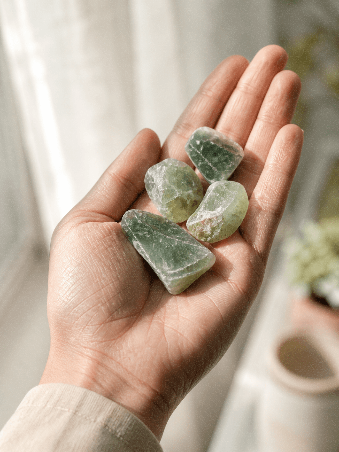
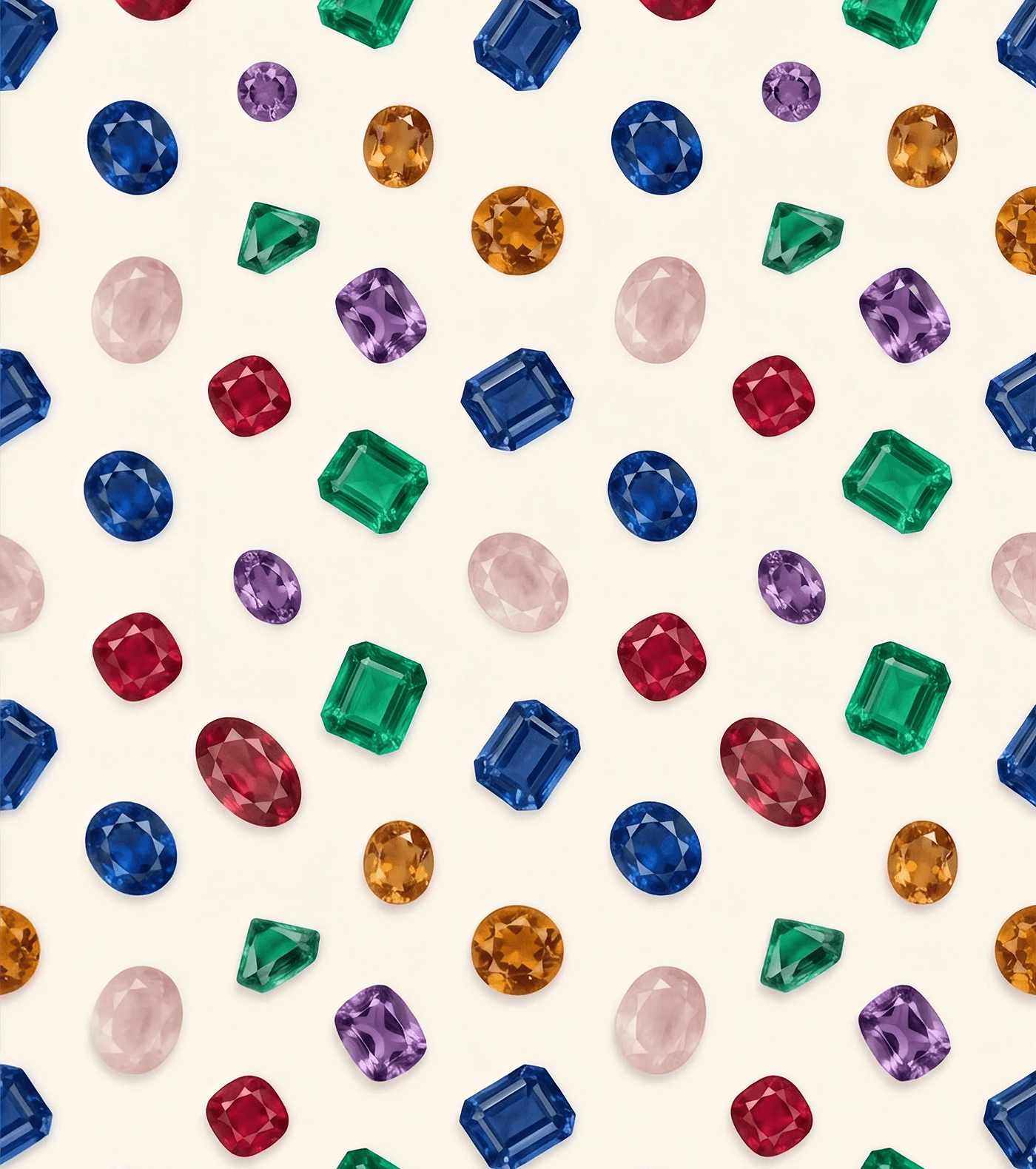
Every gemstone spends millions of years forming in layers beneath the earth unique, rough-edged, irreplaceable. The industry's standard response is to polish the irregularity out. We did the opposite, and let that idea drive every decision in the system that followed.
Visual Identity Design Breakdown:
The Logomark
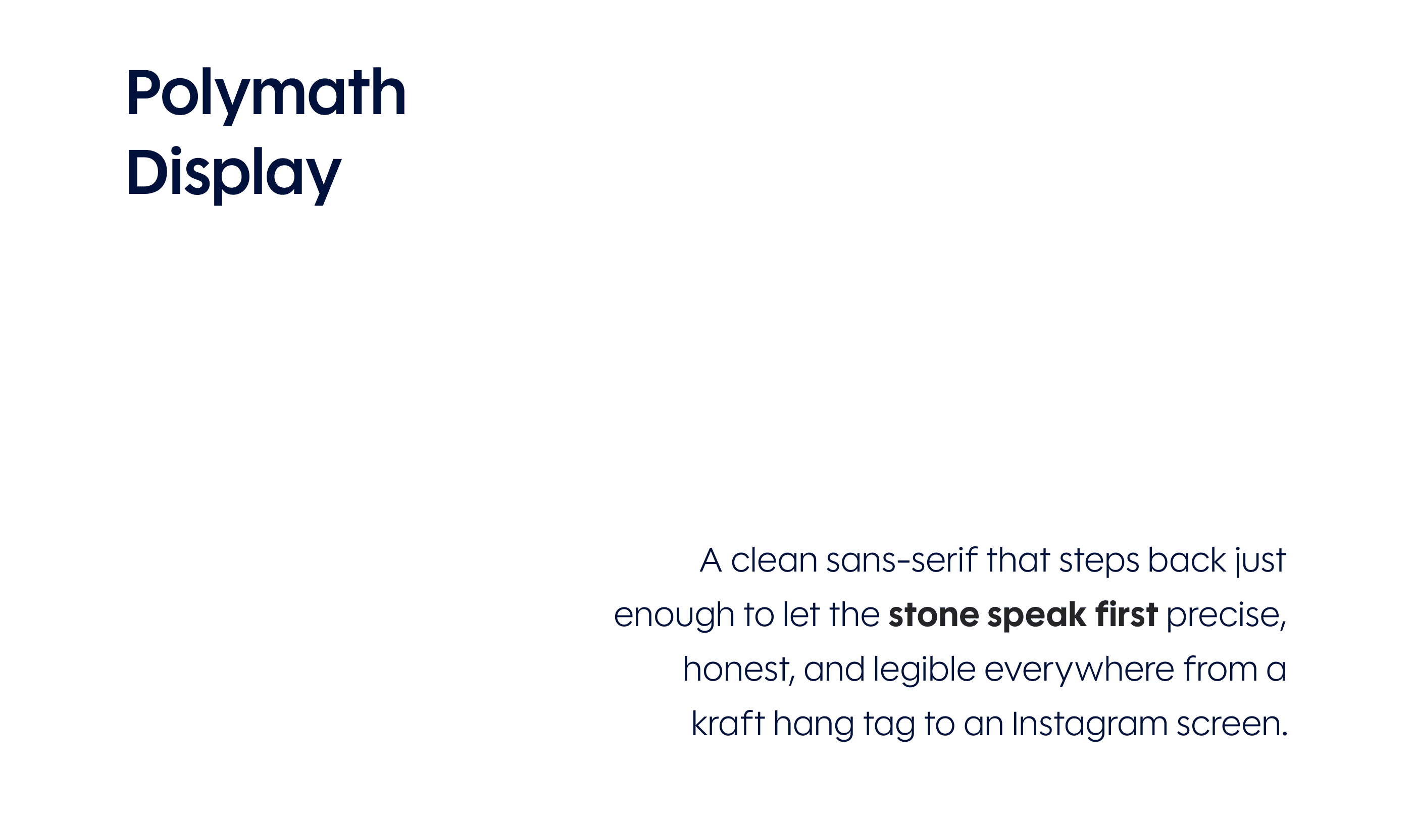
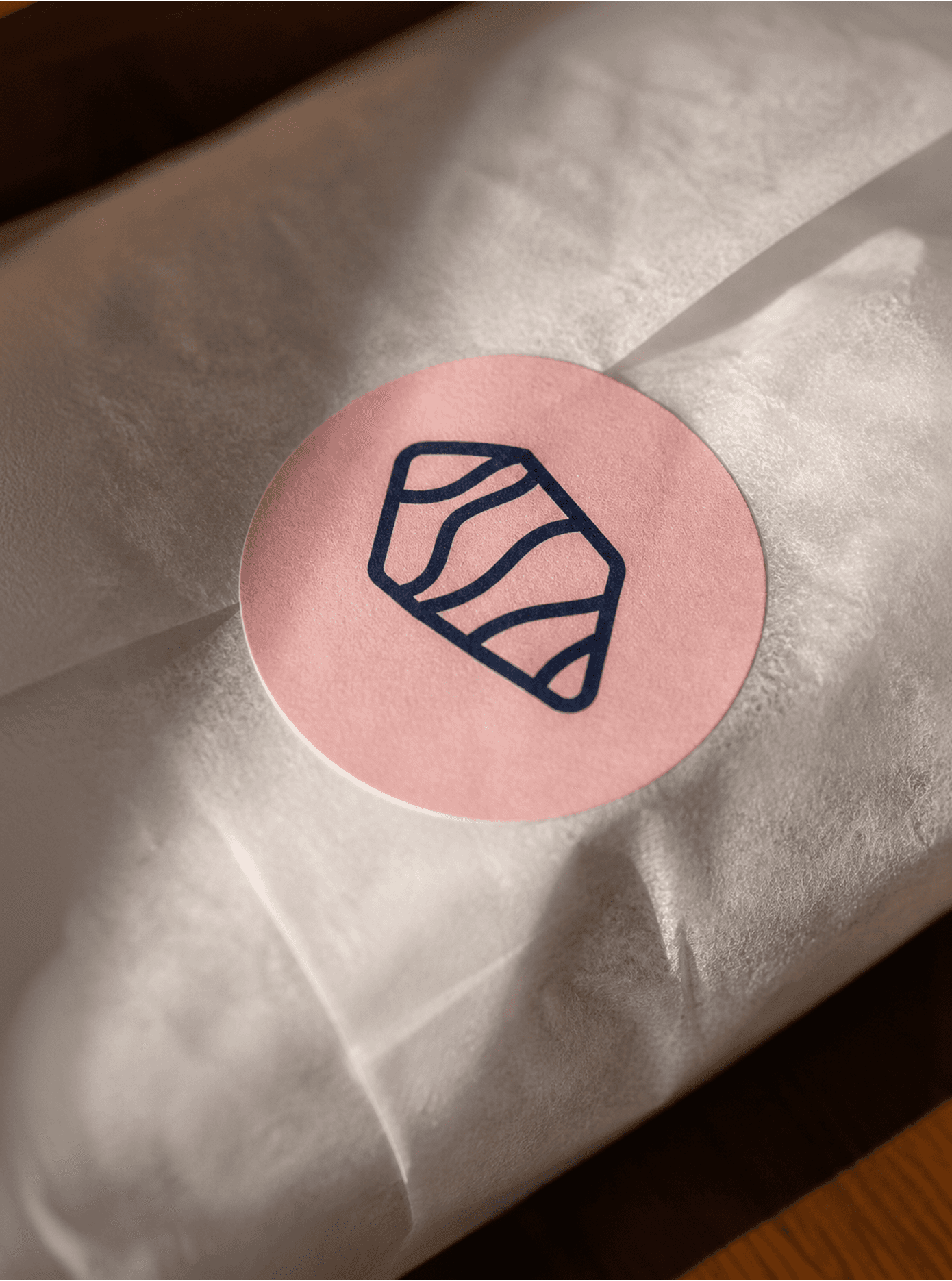
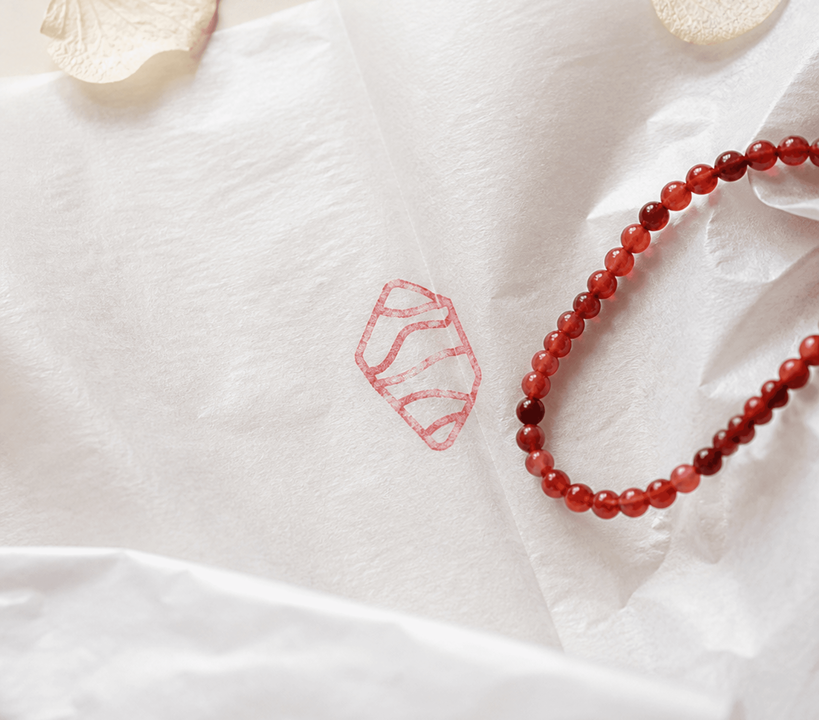
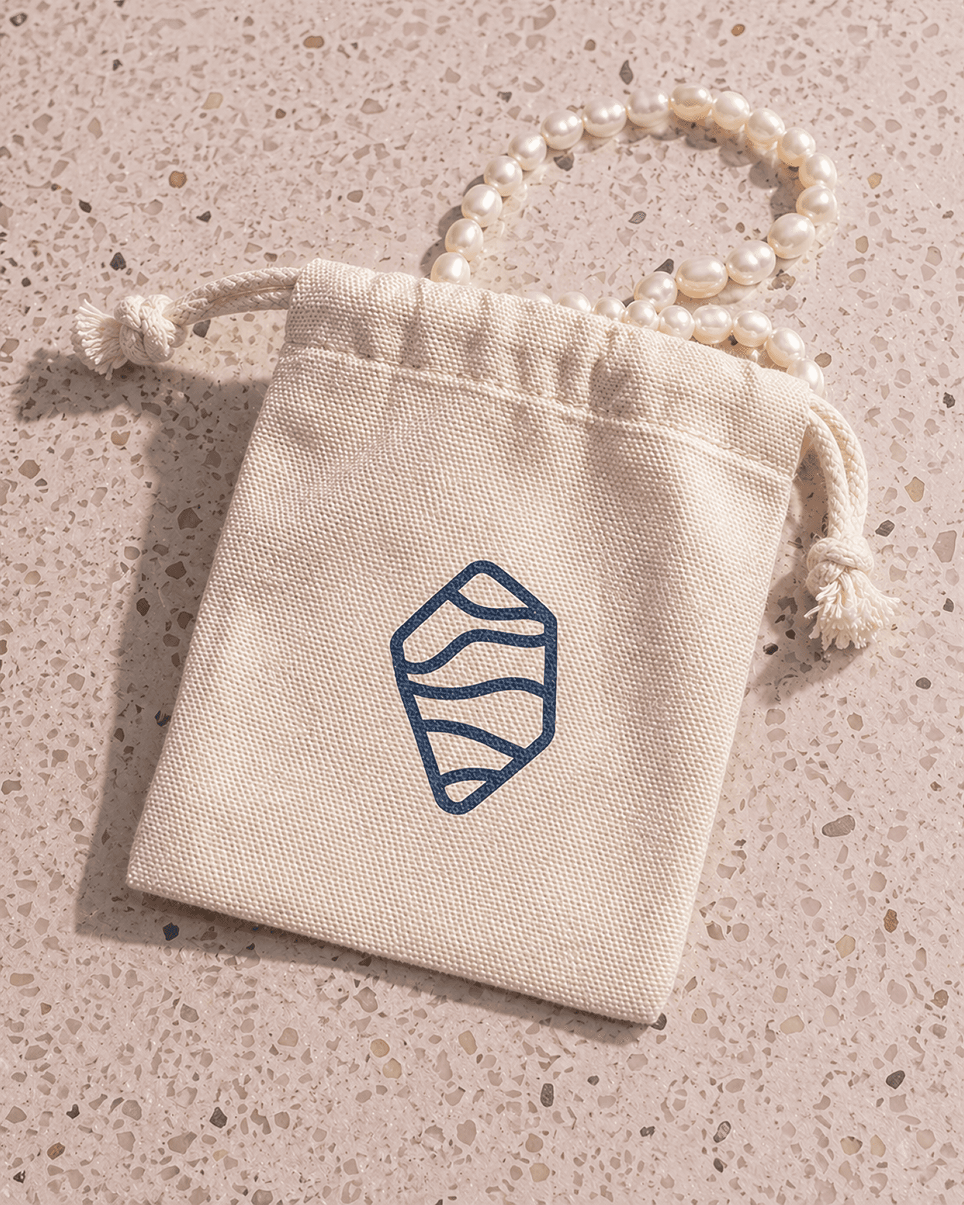
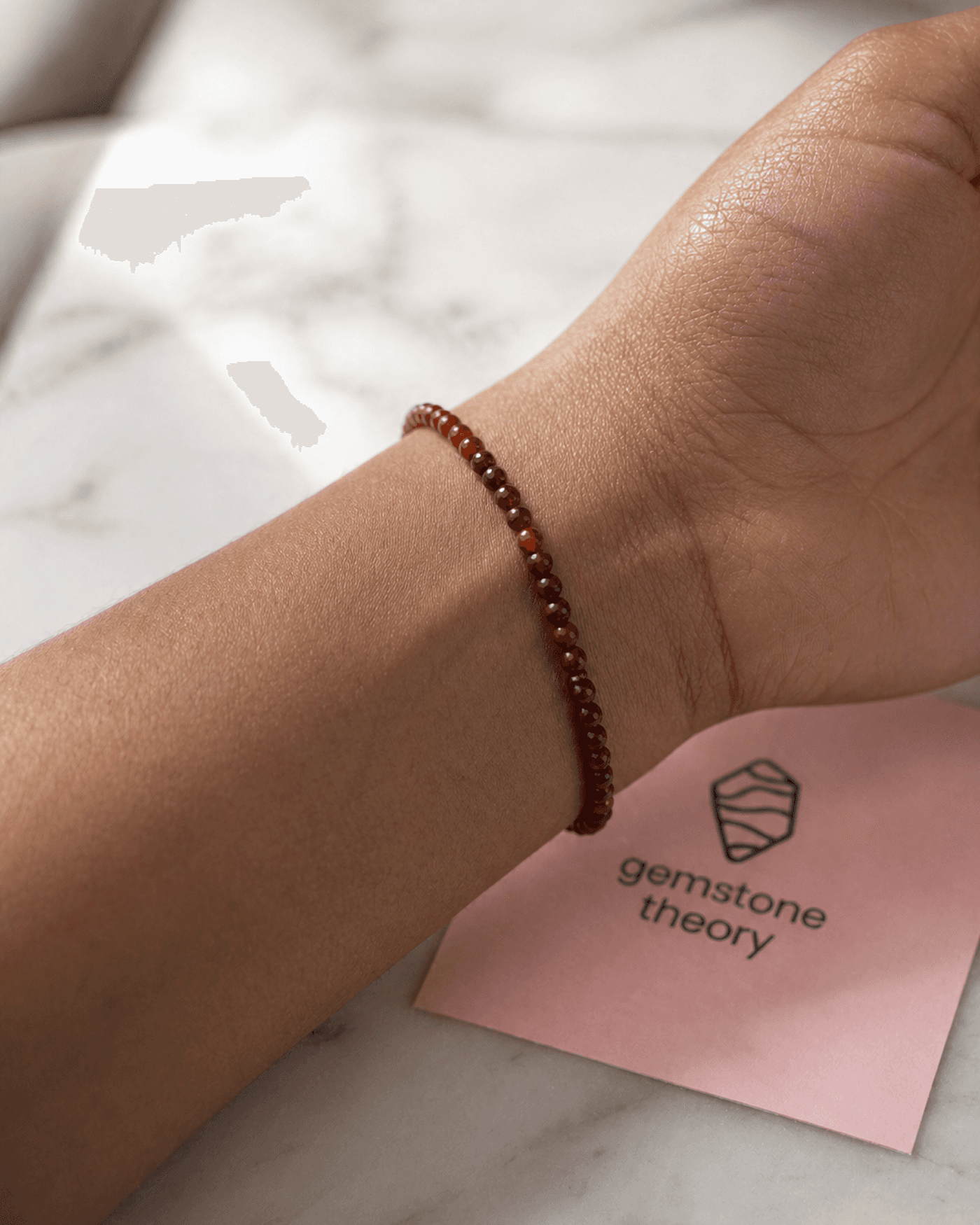
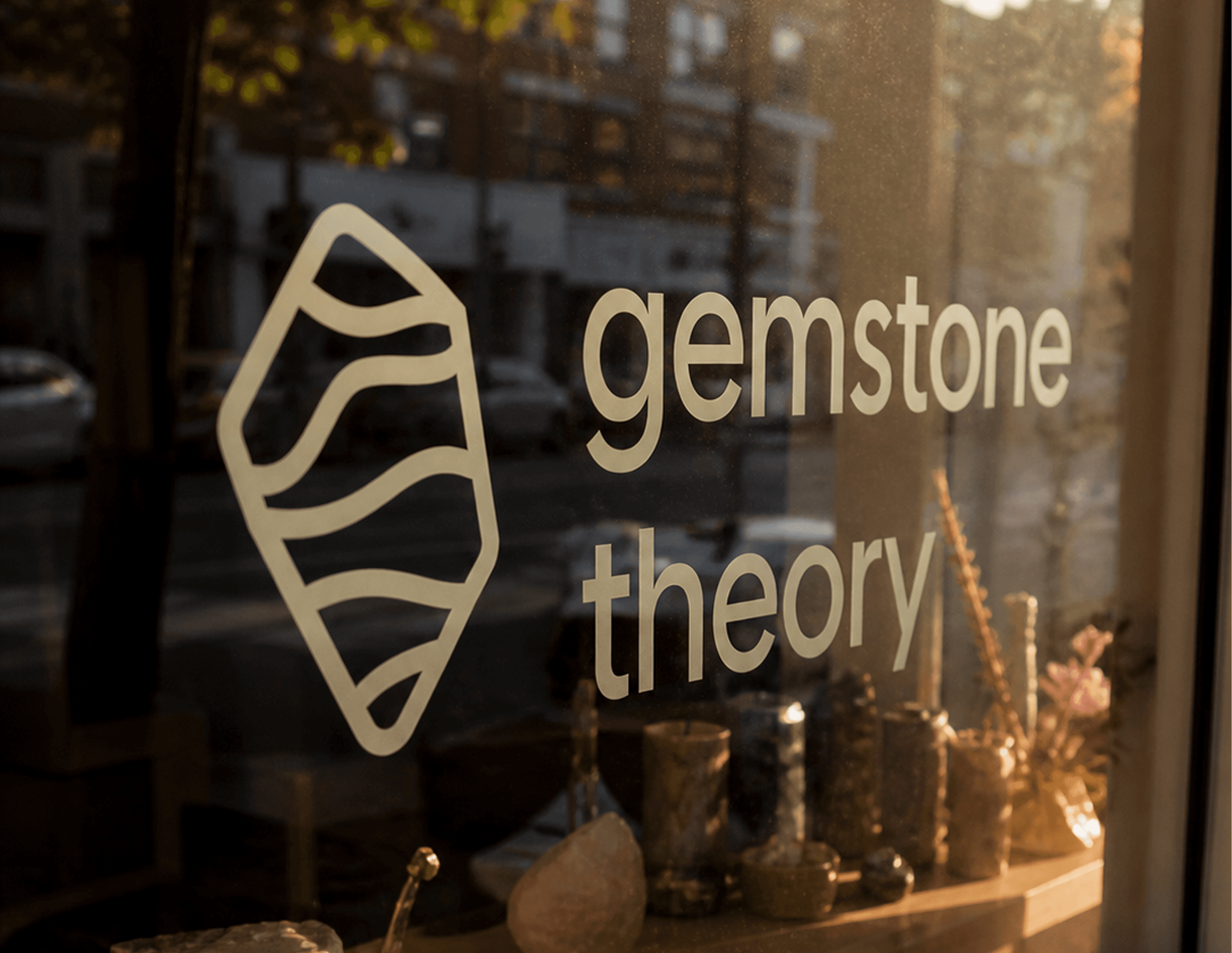
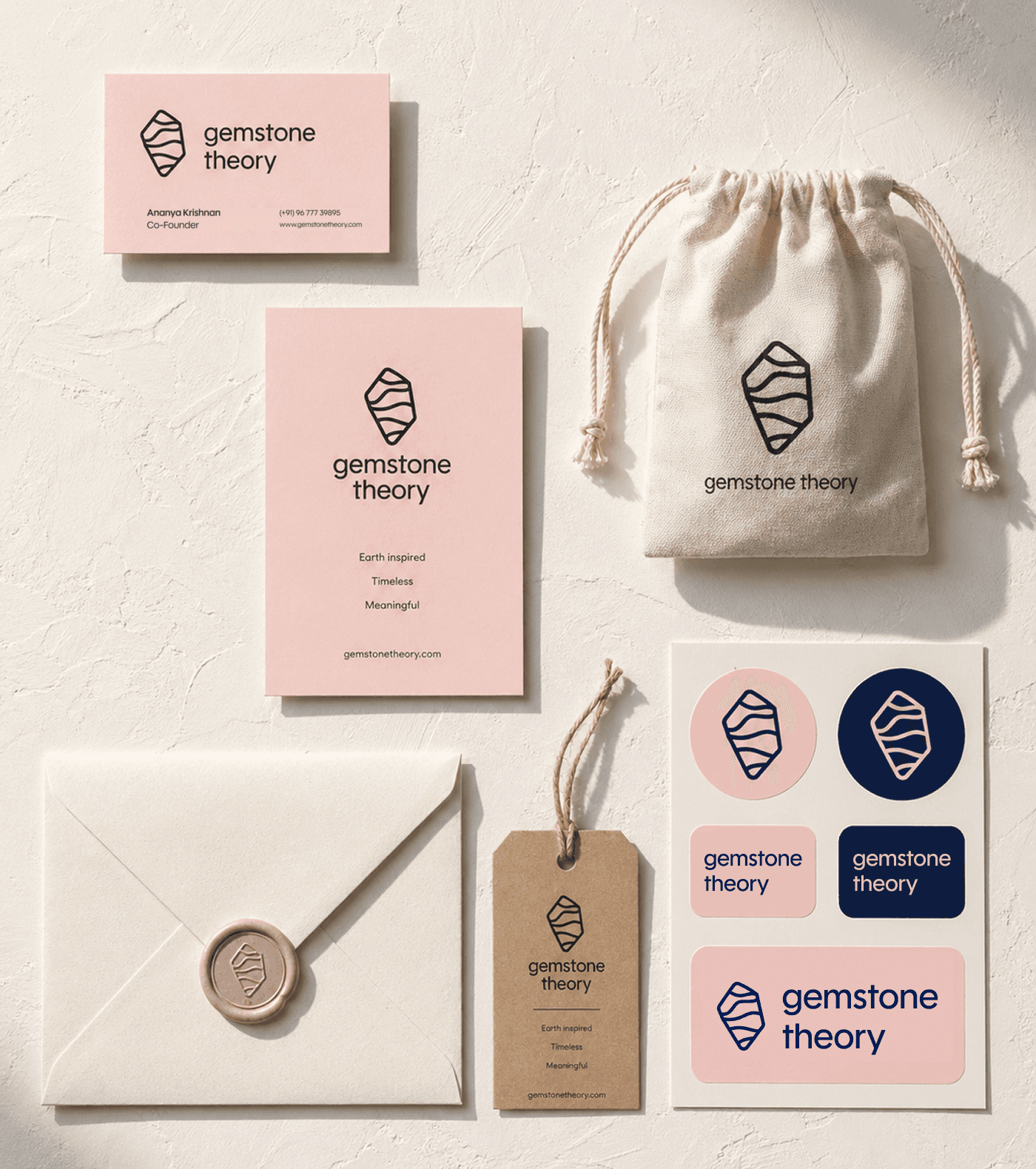
The logomark is a flat stone with visible internal layers, paired with a quiet sans-serif that lets the mark do the talking rather than compete with it. The layered form is a direct translation of the brand's core idea, geological time made into a mark, rather than a decorative flourish. It had to read clearly at business-card scale and hold up as a standalone icon, since it travels across packaging, the theory card, and social before a customer ever sees the full wordmark.
The Color Palette
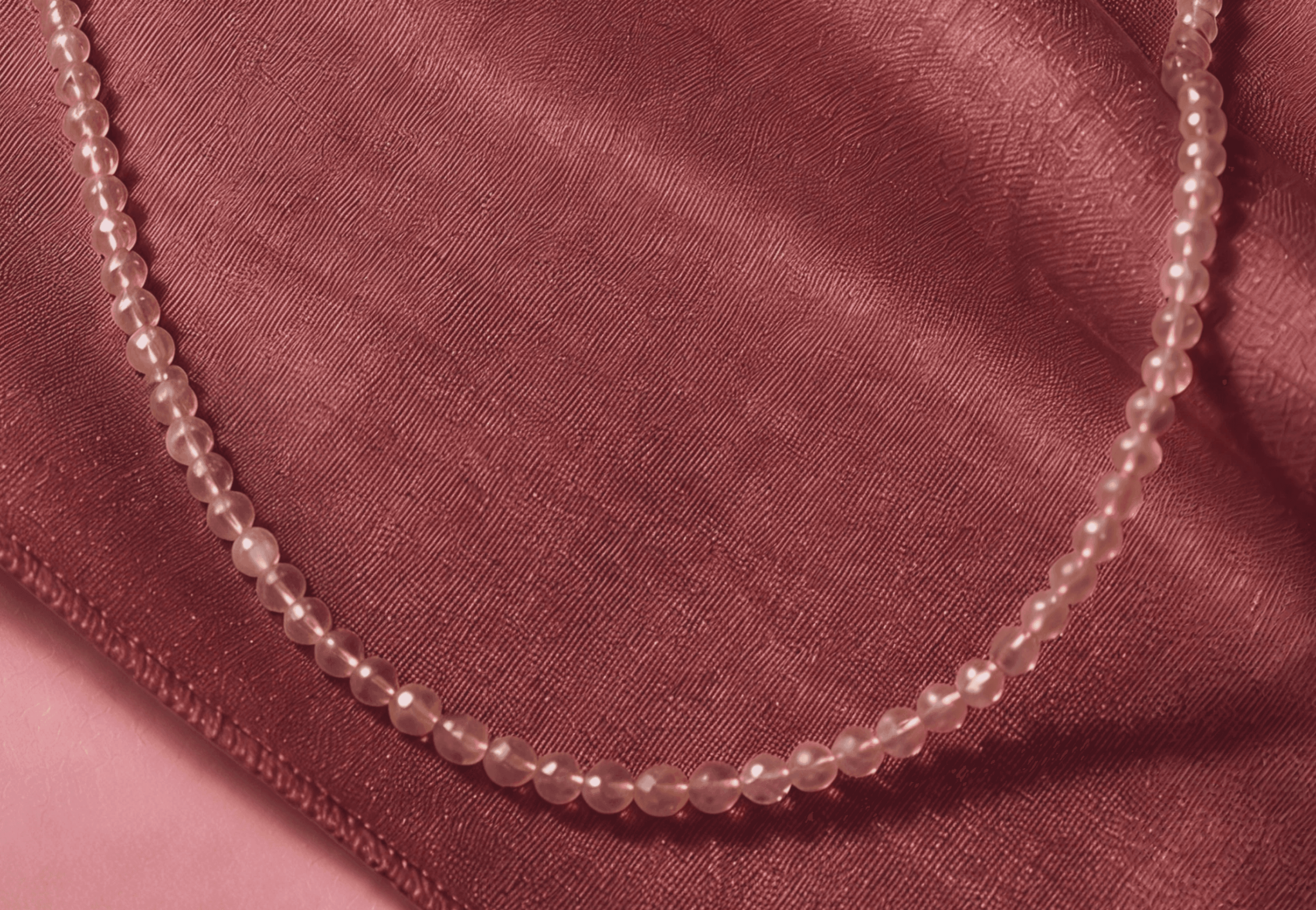
The palette leans into the same contradiction as the mark itself soft against raw, considered against unpolished: pastel pink #FFCEE3 as the primary carries the warmth the raw-gemstone category is missing without tipping into precious or delicate, deep blue #00113C grounds it with near-black depth that reads as credibility and quiet confidence, while dark grey #111111 and off white #F5F5F5 handle typography and negative space so packaging and product photography can breathe.



SKSKS
Brand & Product Designer